See the paint colors in my home – color schemes for a neutral whole home color palette!
These are the neutral paint colors I have in my home.
See how these colors actually look in our interior spaces and exterior!
A question I get all the time is “What are your paint colors?”
Here is a list of my home’s paint colors including the paint color name and color number.
These are neutral colors that I’ve hand picked as a Designer and True Color Expert® to flow and coordinate with our entire house – and absolutely love!
I’m also sharing my all-time favorite, go-to gray paint color too!
It’s the perfect greige, warm gray color!
Check out these helpful color tips!
- 5 Best White Trim Colors
- Top 50 Bestselling Paint Colors At Sherwin Williams
- Paint Tips – How To Pick The Perfect Paint Sheen
- How to Pick Paint Colors With Confidence!
- Get Paint Color Help From A True Color Expert®
- Understand The Color Wheel & Color Schemes To Become A Better Decorator
- Agreeable Gray – Undertones & Coordinating Colors
- Sherwin Williams Repose Gray – Undertones & Coordinating Colors
- Sherwin Williams Pure White
Always test paint colors in your home with large swatches like these large beautiful peel and stick paint samples!
This will make sure the color works with the different lighting and finishes in your rooms.
Make sure to test paint colors in north-facing rooms where the light is cooler and south facing rooms to make sure they don’t clash with the lighting.
Paint Colors in My Home:
I selected these neutral colors for the warmth and style they add to a room.
I also chose them because their undertones coordinate with the undertones in the fixed elements of our home: our exterior siding, flooring, brick ect.
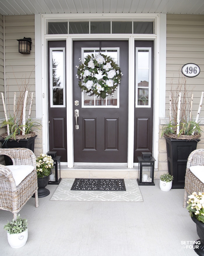
Front Door Paint Color
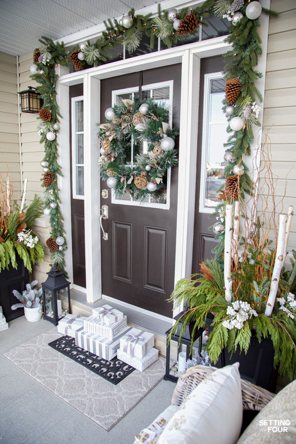
Sherwin Williams Weathervane SW 2927
This is a gorgeous rich dark brown with a hint of black in it.
It’s very versatile and welcoming.
It’s a beautiful brown that coordinates with neutral siding and earthy brick colors, red brick homes and homes with a brown roof.
See – The BIG Mistakes You’re Making Choosing A Roof Shingle Color
Festive, Elegant & Neutral Christmas Porch Decor Ideas
Need help with furniture layout, choosing paint colors, room design, selecting furniture or updating your home?
I’m a Designer and True Color Expert® – I can help!
See my Online Interior Design & Paint Color Services and client reviews.
Email me at [email protected] for more information and rates!
I’d love to work with you!

Entryway Paint Color
Sherwin Williams Mindful Gray 7016.
This is my all time favorite gray paint color!
I love it so much I used it as the wall color for most of my first level spaces.
It’s one of the most popular neutral grays.
In fact I love all of the colors on this color strip!
It’s a light gray and is a warm color.
It’s a beautiful shade of gray that’s versatile and inviting!
I used Sherwin William’s washable matte finish on all of our interior walls – but you could use eggshell or satin finish.
How To Pick The Perfect Paint Sheen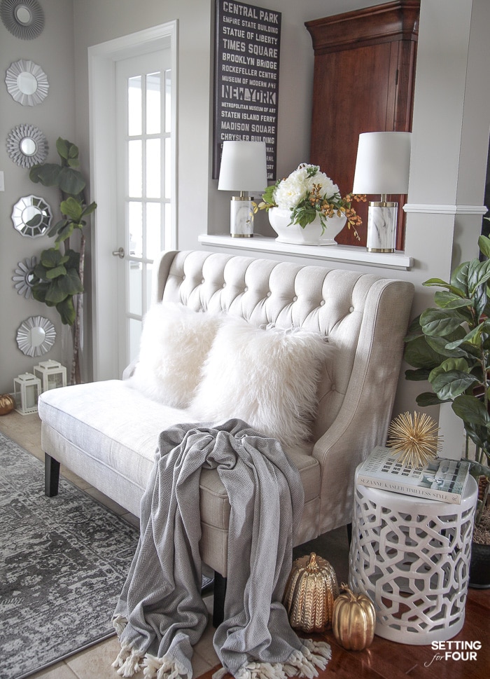
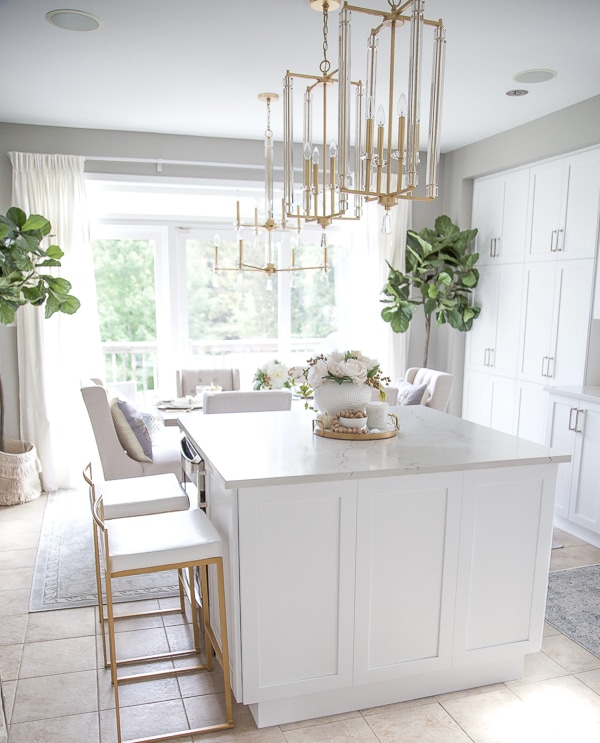
Kitchen Walls Paint Color
Sherwin Williams Mindful Gray 7016
This gorgeous color coordinates beautiful with our new white kitchen cabinets and beige-gray tile floors!
Mindful Grays undertones are a green grey so it compliments clean whites and green beige flooring.
It has a slight green undertone which makes it warm and inviting not color or sterile looking.
If you want a space to feel warm and cozy select a paint color with warm undertones such as green and beige undertones.
A paint color with a blue undertone will look and feel cool.
See: Our Dated Tuscan Kitchen Remodel – Before and After!
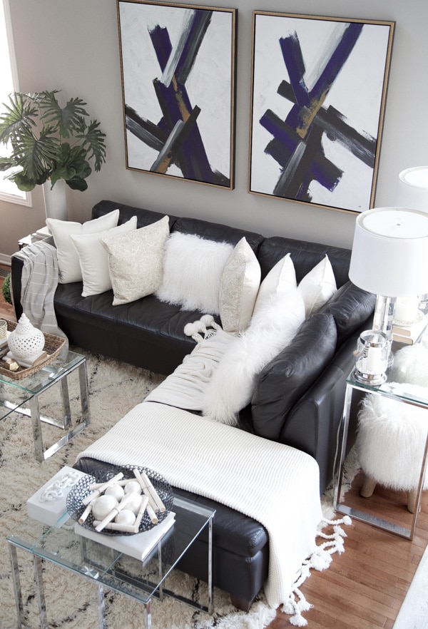
Family Room Paint Color
Sherwin Williams Mindful Gray 7016.
It look gorgeous with our brown hardwood floors, makes the floors look chic and stylish!
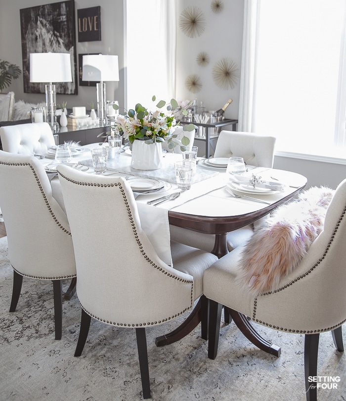
Dining Room Paint Color:
Sherwin Williams Mindful Gray 7016
Our family room and dining room are open concept spaces so I kept the paint color the same to create a cohesive look.
See – How To Update Dining Room Furniture
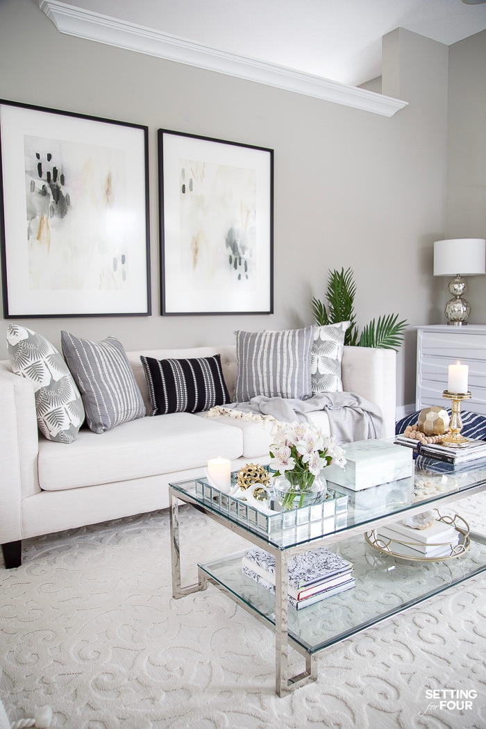
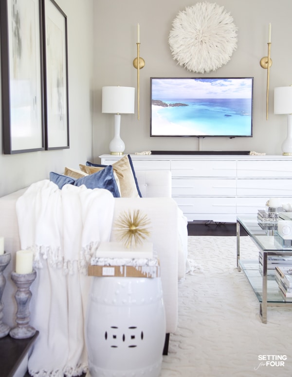
Living Room Paint Color:
Sherwin Williams Mindful Gray 7016
Repeating this beautiful gray throughout the main living spaces makes our home look pulled together.
It avoids clashing sight lines as you move from one room to the next!
How To Arrange Furniture In A Small Living Room
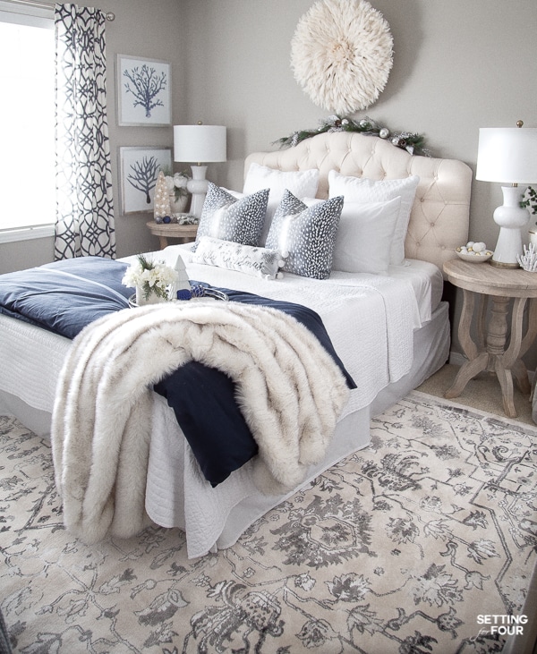
Guest Bedroom Paint Color:
Sherwin Williams Mindful Gray 7016
This is a north facing room that gets a lot of natural light from the one window.
Mindful Gray looks gorgeous with the cream upholstered bed and blue accents!
Small Bedroom Ideas To Maximize Space & Style
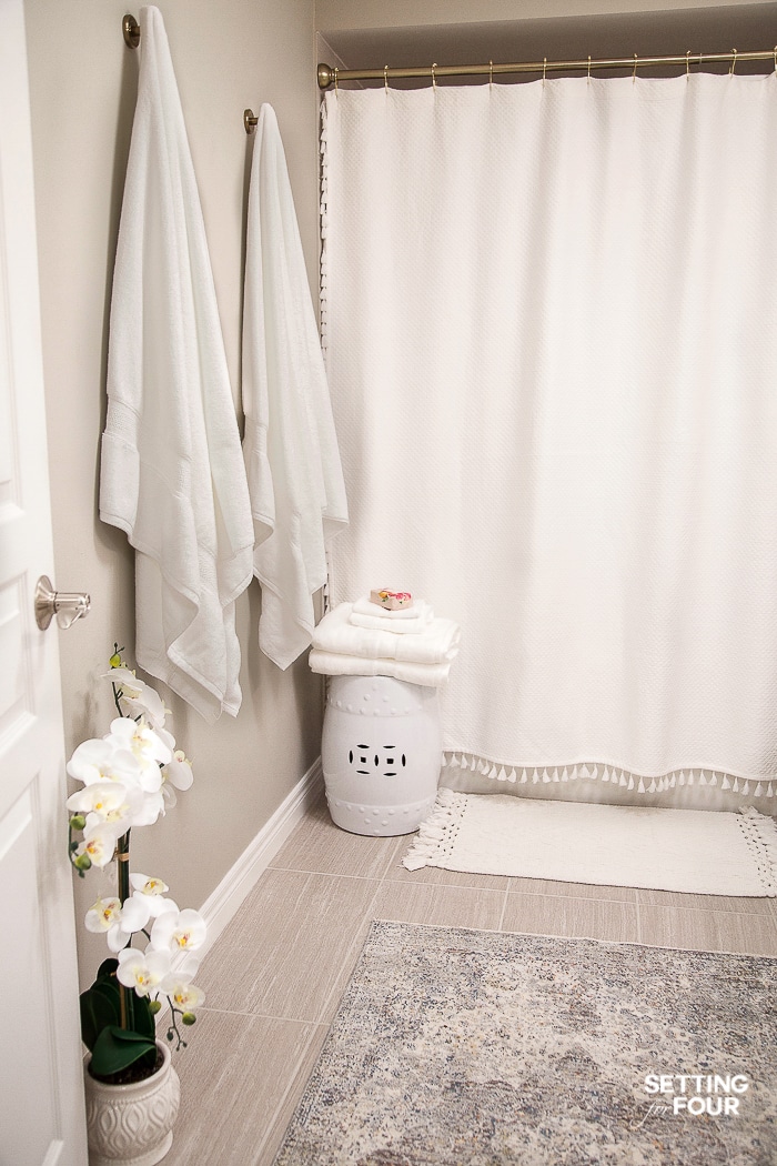
Basement Bathroom:
Sherwin Williams Mindful Gray 7016
This color looks gorgeous with our gray floor tile, white vanity, white shower curtain and white accents.
It looks stunning with these lighter colors!
Frequently Asked Questions
What is the best color to paint a house?
White and black exteriors are very popular right now.
For interior spaces neutral colors in light tones such as white and beige as well as black interiors are popular.
Blue paint colors are popular for coastal style homes, bedrooms and bathrooms for a spa look.
Inexpensive Ways To Stage Your Home To Sell Quickly!
Is it better to paint a house darker or lighter?
It all depends on the look and feel you are going for.
Darker colors look cozy, chic and sophisticated.
Lighter colors look fresh and airy.
5 Design Tricks To Brighten A Dark Room
Should you paint your entire house the same color?
More paint tips and paint ideas:
- Behr Cracked Pepper Undertones & Coordinating Colors
- Behr Blank Canvas Color Of The Year 2023
- How To Decorate A Room In 5 Simple Steps
- How to Make A Mood Board For Interior Design
- 5 Cozy Small Spaces And Nook Ideas
- Sherwin Williams Evergreen Fog
- Behr Back To Nature Paint Color
- 7 Ways To Make A Small Room Feel Larger Instantly!
- How To Arrange Furniture In A Small Living Room
- How to Paint Tile – Easy Fireplace Paint Makeover
- 5 Ways To Create A Whole Home Paint Color Scheme
