Understand The Color Wheel & Color Schemes To Become A Better Decorator
Understand the color wheel and color schemes to become a better decorator!
“What colors go together?”
“Why does the color of my painted walls look so bad in my room?”
These questions and more are answered in this fun color design lesson!
You’ll learn how to pick colors that work beautifully together to decorate your home!
Learn the best color schemes and color palettes in interior decorating. 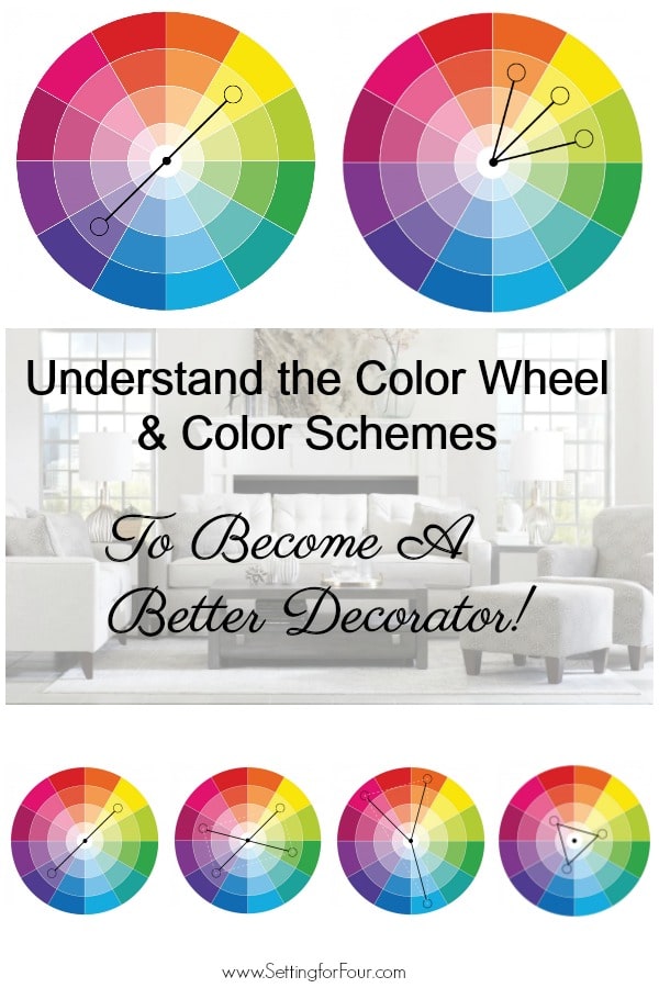
Decorating a home with a pulled together, cohesive look, beginning a room design and picking paint colors is all about picking colors that work together and work with what you already have in your home!
You need to pick colors that work with your fixed elements like your flooring color, countertop color ect and with the type of light that you have in your room (sunny vs dark room).
All of this boils down to understanding color, what colors go together and the color wheel.
Do you need help with furniture layout, room design, selecting furniture or choosing paint colors?
See my e-design & paint color services info – and client reviews!
Email me at [email protected] for more info!

WHY LEARN ABOUT THE COLOR WHEEL?
The key to become a better decorator is learning about color!
Color affects everything in interior decor. From the color of our painted walls, the color of our furniture, of our art and flooring to the color of our decor!
We see color based on how it reflects off of a surface.
To learn about color you need to understand the color wheel, the relationships that colors have with each other and how the color wheel works!
Learning about the color wheel will help you choose color combinations that work well together.
The process of creating harmonious color schemes with confidence is called color theory.
Once you understand the basics of using the color wheel, you can start to create more sophisticated color schemes by playing with different elements of each color.
For example, you can change the value (lightness/darkness) and intensity (brightness/dullness) of colors to create combinations that suit your design style.
HOW THE COLOR WHEEL WORKS:
If you don’t own a color wheel I suggest you buy one – this is the one I have and I use mine all the time with my interior decor clients and when I’m decorating my own home.
The color wheel is a visual representation of 12 colors arranged according to how they relate to each other.
It’s displayed in a circle or wheel like this:

The color wheel includes 12 basic hues: the three primary colors (red, yellow and blue), three secondaries, and six tertiary colors.
The primary colors of red blue and yellow are pure, you can’t create them from other colors, and all other colors are created from them.
Secondary colors are orange, green, and violet. They are formed when equal parts of two primary colors are combined, so they lie between the primaries on the color wheel.
Tertiary colors are formed by mixing a primary color with a secondary color next to it on the color wheel.
For example, mixing one part blue with two parts red makes red-violet.
Using the Color Wheel to Create Color Schemes In Your Home
The color wheel helps you mix colors to get color palettes with varying degrees of contrast.
These are the four common types of color palettes (color schemes):
Monochromatic Scheme:
These tone-on-tone combinations use several shades (adding black) and tints (adding white) to one basic color, one single hue for a subtle color palette.
It uses variations of one hue.
Such as light blue, cobalt blue, and dark blue (navy).
Or fuchsia, pink and light pink.
The monochromatic color scheme is one I personally use and love. It’s on trend as well.
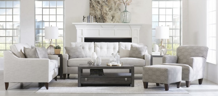
This living room has a monochromatic color scheme using shades of gray, black and white. It’s a very relaxing and peaceful color palette.
Designer tip: A monochromatic color scheme can tend to look flat and boring if it’s done the wrong way. The way to make it interesting and dynamic is to use pattern and lots and lots of texture! Use cotton, velvets, sisals, fringe, pompoms ect. These textural details make a monochromatic color palette look sensational!
Also adding lots of metallic finishes makes a monochromatic color palette look breathtaking. Use gold, brass, silver, matte black and/or mercury glass finishes. Use whichever metallics you personally love. Mixing metallics is a hot trend so don’t be afraid to mix them up! And don’t forget to use the 60-30-10 color rule with this color scheme!
Don’t forget to add greenery (faux or real) to take a monochromatic color palette to the next level.
Add faux trees and plants (I love my faux fiddle leaf fig trees and faux snake plant), vases of real flowers and real houseplants (this company delivers gorgeous real potted houseplants right to your front door!) to a monochromatic color scheme for interest and texture!
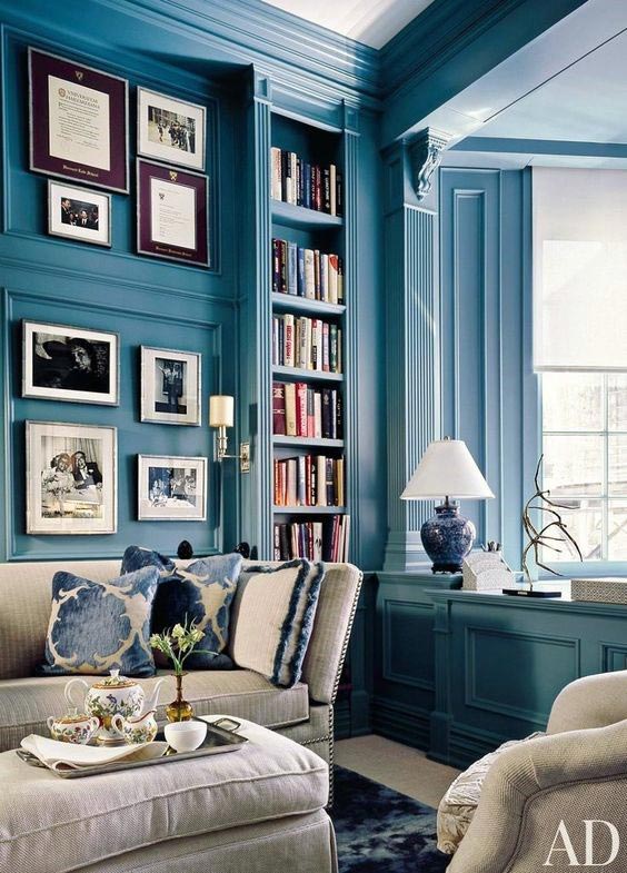
This is a living room using a blue monochromatic color scheme. Various shades of blue are used in the paint color (Oceanside from Sherwin Williams), the pillows, area rug and the lamp. This is a gorgeous and relaxing color scheme!
Analogous Scheme: For a room with more color contrast use this color scheme! An analogous palette includes 3 colors found side by side on the wheel, such as orange, yellow, and green, for a colorful and relaxing feel.
For example: set a table with a mixture of yellow daffodils, orange napkins and green plates. This is an analogous color scheme!
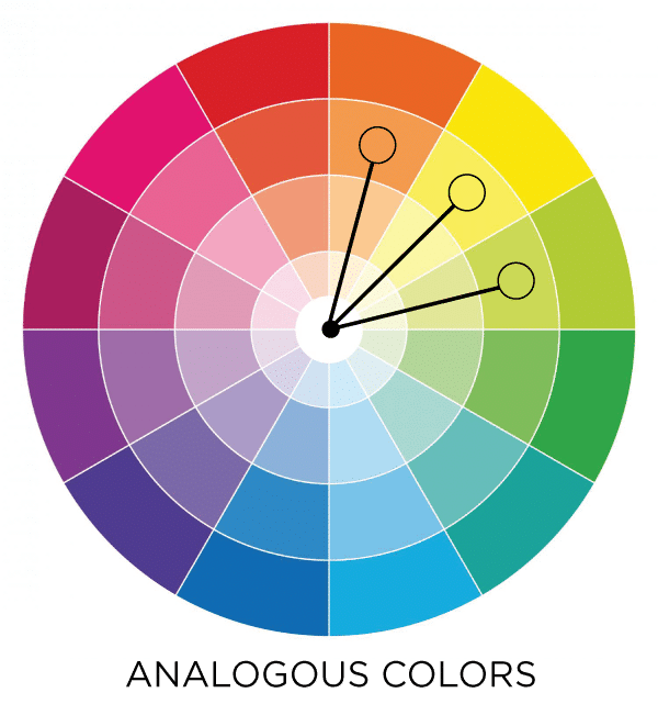
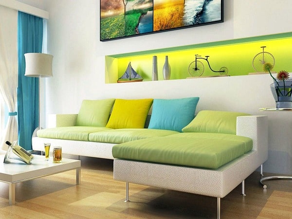
This is a bright living room with a Blue-Green, Green, Yellow-Green analogous color scheme.
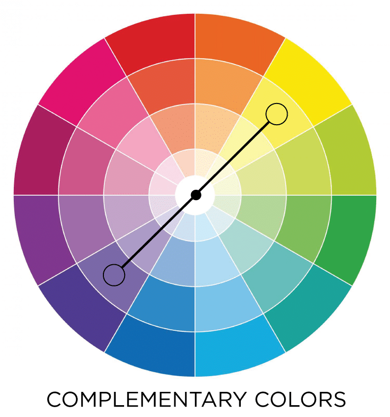
Complementary Color Scheme: This is the simplest color scheme that will add energy to a room. It uses two hues opposite each other on the color wheel, such as violet and yellow.
Complementary colors appear brighter than each single color by itself when used together in this way.
Blue and orange is a popular complimentary color scheme.
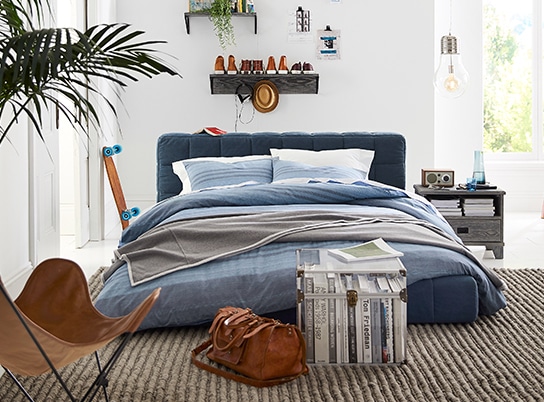
This boys bedroom is a blue and orange complementary color scheme with blue upholstered bed and bedding and the caramel (with orange undertone) leather chair and caramel colored bag, skateboard and hat on the shelf.
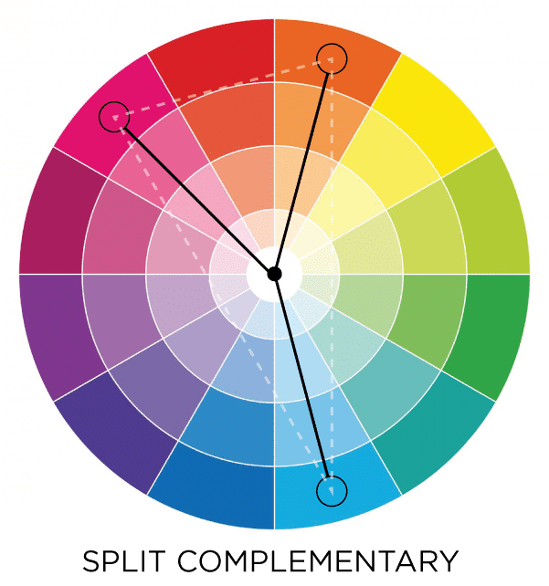
Split Complementary color scheme: This is a more layered and colorful color scheme than complementary. It uses the two colors that are on each side of a color’s compliment.
First step is to select the main color. Next, find its complementary color and then select colors from each side of the complementary color.
For example yellow paired with red-violet and blue-violet.
You could use this color scheme when mixing colored flowers in a vase for a beautiful bouquet or with your tablescape colors (dishes, napkins, flowers)
Triadic Scheme: This is for color lovers! A triad creates a very colorful palette by using three hues evenly spaced on the wheel.
This is a balanced color scheme with high contrast.
Turquoise, fuchsia, and yellow-orange is an example.
Triad schemes are often quite vibrant, so it’s best to choose one dominant color and use the other two as accent colors.
This color scheme works well in boho style rooms!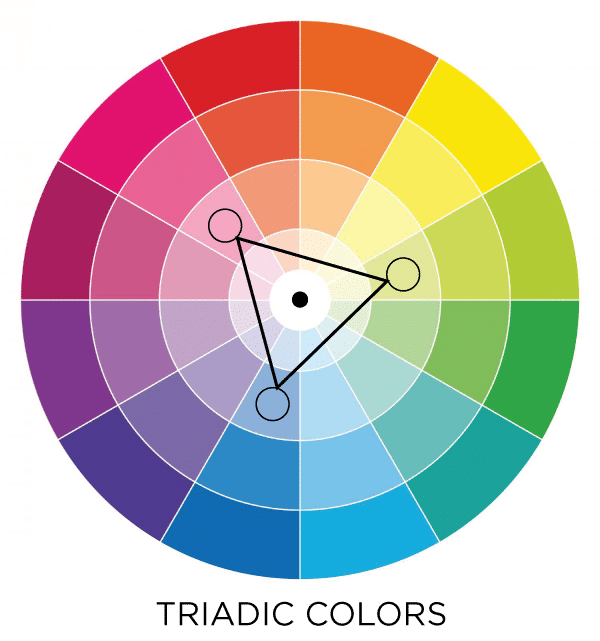 Tetradic color scheme – uses 4 colors that lie in a rectangle pattern on the color wheel as seen below. This is also a high energy and colorful palette. This beautiful area rug has a tetradic color scheme.
This is a great color scheme for a flower garden!
You might also find this color scheme in wall art. This is a great color scheme to start decorating a room with as well, since it gives you 4 colors to layer into your space (pillows, decorative accents)
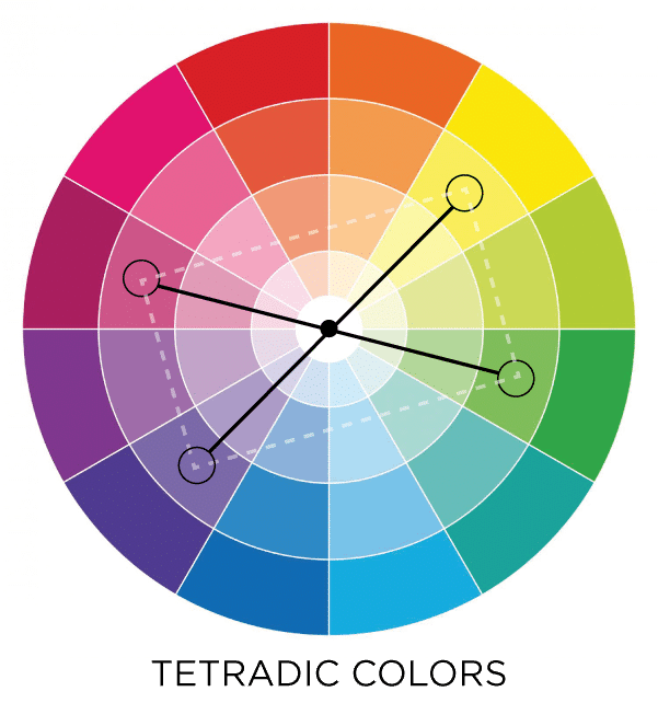
Square color scheme – uses 4 colors that lie in a square pattern on the color wheel as seen below. This is a high energy, colorful color scheme.
Again I would use this color scheme in a flower garden, a colorful tablescape or in a colorful piece of wall art.
This is a fun color palette for bold, colorful kids playrooms that stimulate!

Using The Color Wheel to Select Warm Colors VS Cool Colors And Their Feeling
The color wheel also is a great way to find cool colors that go together and warm colors that go together.
It’s also a fabulous way to figure out what colors to use in a room for the mood you want the room to have.
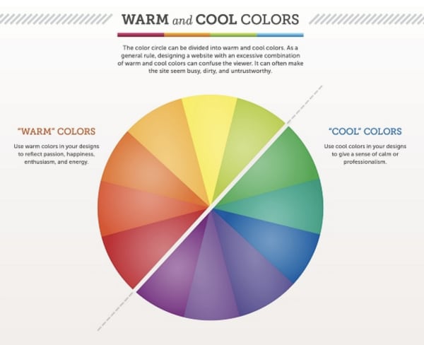
The color wheel is made up of cool colors on one side and warm colors on the other.
Cool colors are blues, greens, and violets. These colors make a room feel relaxing, soothing. They reflect calmness, serenity and professionalism. These colors are perfect for bedrooms, bathrooms, soothing living rooms.
Warm colors are reds, oranges, and yellows. These colors make a room feel invigorating, energetic, lively and up-lifting. They add visual warmth and joy. They reflect passion, happiness, energy and enthusiasm. They are great for kids playrooms, lively dining rooms, lively living rooms and energetic home offices.
Take a look at the feeling colors can give a room:
Now that you understand the color wheel, color schemes and the feelings colors give a room you’ll become a better decorator!
So grab your color wheel and start decorating your home, tablescapes and gardens by picking from these tried and true color palettes that will give the feeling you want your home to have!
More Design and Decor Ideas:
- Repose Gray – Undertones & Coordinating Colors
- How to Make A Mood Board For Interior Design
- Modern Classic Living Room-Design & Styling Ideas
- Top 50 Bestselling Paint Colors At Sherwin Williams
- Agreeable Gray – Undertones & Coordinating Colors
- 5 Best White Trim Paint Colors
- How To Arrange Furniture In A Small Living Room
- 5 Design Tricks To Brighten A Dark Room
- Paint Tips – How To Pick The Perfect Paint Sheen
- 7 Ways To Make A Small Room Feel Larger Instantly!
- 5 Decorating Mistakes That Make Your Home Look Cluttered

I am almost finished with a kitchen remodel going from medium stained oak wood cupboards to white uppers and black lowers. Granite is white with black spots and some gray spots. Problem is I have an open concept room. Dining table is wood with wood chairs. Living room has very comfortable khaki colored couch and black loveseat. Don’t know what to paint walls. Would like blue as accent color. So I have white, black and khaki so far with warm wood floor. Gold trim around black fireplace. Can you help?
Hello Sherrie Le – Yes I can help you! Email me at [email protected] to enquire about my online color services! xo Heather