Design Tip: The 60-30-10 Color Rule
In this post I’m sharing a helpful Design Tip: The 60-30-10 Color Rule!
A visually appealing, well ‘designed’ room is based on harmony and balance of color.
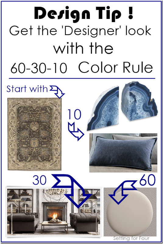
A design ‘rule of thumb’ to create a space that flows is to use the 60-30-10 color rule.
This combination of colors creates rooms that are cohesive and visually interesting.
What Is The 60-30-10 Color Rule?
60% of a room can be filled with a dominant color, 30% with a secondary color, and 10% with one or two accent colors.
Why are there three colors in this color rule?
Because too many colors in a room will create a visually ‘loud’ space.
Remember, we are trying to find harmony and balance!
How Do You Use The 60-30-10 Color Rule?
- 60% of the room’s color (dominant color) will be on the walls.
- 30% of the room’s color (secondary color) will be in the rugs, furniture, textiles and upholstery.
- 10% of the room’s color (accent color) will be in the artwork, photo frames other decor accessories.
60-30-10 Color Rule Example
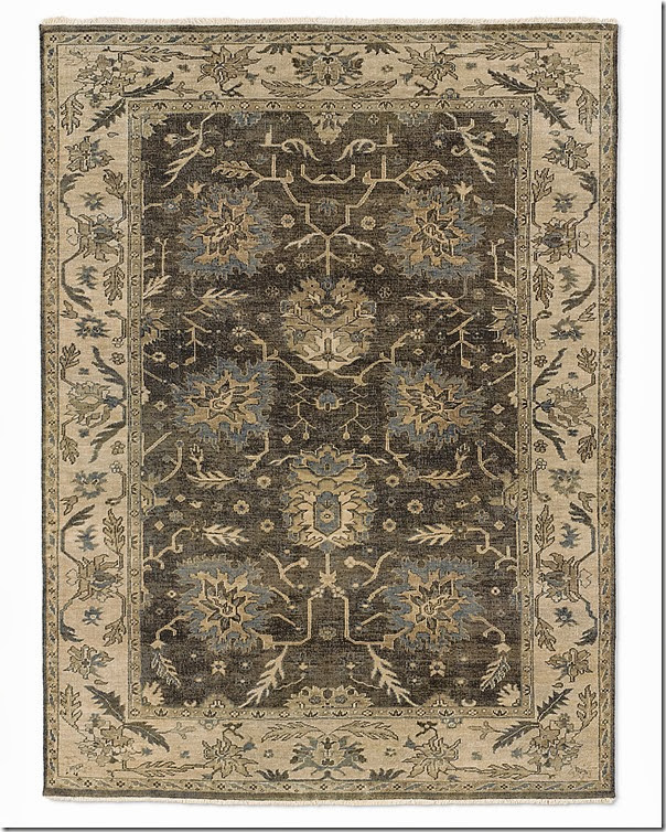
So let’s put this into practice using a beautiful rug for your living room or bedroom as inspiration: this beautiful grey, greige, blue and beige area rug.
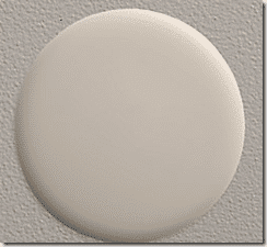
1) Start by choosing your wall color. This will be your dominant color – it will make up 60% of your room.
Let’s choose the light greige color in the rug for the wall color:
2) Next choose a secondary color which will make up 30% of the room.
Let’s use the dark charcoal grey color that’s in the rug!
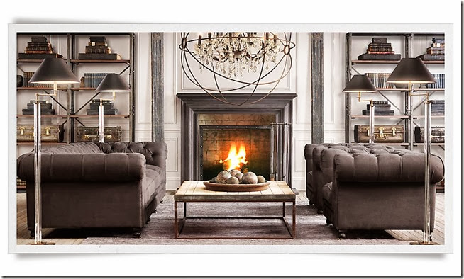
Use this dark charcoal grey color for your living room sofa:
3) The last color choice is the accent color which will make up 10% of the room.
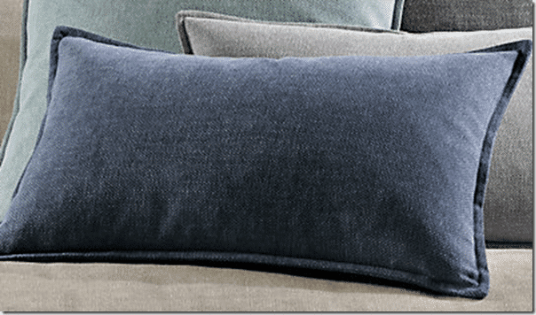
Let’s choose the gorgeous blue color in the rug for pillows and accessories!
That’s how you use the 60-30-10 color rule to create a cohesive living room color plan!
60 % light grey, 30 % charcoal grey, 10 % blue.
Of course you could apply this to other color combinations too using your favorite accent color like blush, navy, black or green!
What do you think of this design rule of thumb? Do you find it helpful?
** You can also check out my Design Tip: How to Pick the Perfect Chandelier Size and Printable Size Guide **
More Design and Decor Ideas:
- Top 50 Bestselling Paint Colors At Sherwin Williams
- Agreeable Gray Undertones & Coordinating Colors
- Online Decorating Services & Color Advice
- How to Pick Paint Colors With Confidence!
- Color Of The Year 2021 Sherwin Williams Urbane Bronze SW 7048
- 5 Ways To Create A Whole Home Paint Color Scheme
- Lake House Bedroom Paint Color Ideas, Furniture &; Decor Ideas
- How to Paint Tile – In 3 Easy Steps!
- How To Arrange Furniture In A Small Living Room
- How to Mix Design Styles So They Don’t Clash!


Good to know!
Thanks Sharon – I’m glad you find this helpful!
I’ve never heard this before, good info! I’m going to use this. 🙂
Oh great!! I’m so glad you like this post Rosa! Have a wonderful day!
Heather- Thanks for the really useful information! That’s the first time I’ve read it but now I’ll be conscious of the guideline when I’m pulling my own rooms together.
You’re welcome Wendi! I’m glad you find it useful like I do!
I’ve never heard this before. Next time I redecorate, I’ll have to keep this in mind! 😉
Great post, Heather! A tip that’s easy to remember, too. 🙂
Heidi
Thanks Heidi – I’m glad you enjoyed this tip!
Such good tips! Thanks for sharing.
I’m glad you enjoyed these design tips Kayla! I linked up to your party – fun!
Fantastic tip Heather!! Thanks so much for linking up to Monday Funday!!
Great tips Heather! I know when I get “stumped” on a space I go back and apply that 60-30-10 rule – works every time! Thanks for sharing!!
Thanks Heather – so glad you use and love this tip too!
This makes so much sense. I think I often do this subconsciously, but without awareness. Great to know.
A great rule! It’s a good reminder when buying things like rugs. I’m always tied up trying to figure out what colour it should be… but the colours are already in the room!! (wall colour, furniture colour, accent colour).
Love this! Right in the middle of decorating our front room. We have a similar wall color and rug. Very helpful in guiding me on which 10% color I want to bring in. Maybe I will make a departure from my usual red this time.
Oh great – I’m so glad you found my post helpful! Have fun decorating your room!
I wish I knew this rule before I started redecorating my rooms! Great tip! One I will remember as I keep working on my home!!!
In your example 90% percent of the room is neutral, but I’m one of those nuts who loves color. How does this formula work for me?
You can use the same formula! 🙂
Great tips, thank you! Do you have a link for the rug? I love the green and beige in it. Thank you!
I’m so glad you liked this design tip! That rug is discontinued unfortunately.
Great tip. I think singly this is the most useful tip for decorating hands down. Easy to remember. Works in all situations for all styles. Then, to extend this theory though your home for a cohesive ( but not totally repetitive) look use the 60/30/10 in other rooms but change up which colour is primary/secondary and accent – in the same family. Is so easy and it brings together a home with a simple principle.
I’m so glad you enjoyed these color tips!