Repose Gray – Undertones & Coordinating Colors
Repose Gray SW 7015 is a warm gray paint color. It’s a beautiful neutral greige that works well with many other colors, on kitchen cabinets and in every room!
And it’s a popular neutral color!
Repose Gray consistently ranks as one of Sherwin Williams top-selling and most popular neutral paint colors!
Today I’m diving deep into Repose Gray to discuss undertones, complimentary colors, real room photos and coordinating flooring.
As a Designer and certified True Color Expert I’m passionate about sharing accurate, trustworthy information on paint colors and how they work in real homes!
There’s a lot of conflicting advice online about this color, but here you’ll find the most precise insights from a professional who understands undertones and color balance.
Because undertones matter so much, choosing the right white is just as important as choosing the right greige. If you’re trying to find the best white paint colors for trim, cabinets, or walls, take a look at my Perfect White Paint Kit to help you choose with confidence!
To help you understand this color even more, I’m sharing the advice of another expert on Repose Gray, Sue Wadden, who is the director of color marketing at Sherwin Williams!
Explore her expert advice, as well as mine, on this gorgeous versatile neutral greige color.
Repose Gray Sherwin Williams 7015 – Undertones and Coordinating Colors!
In this post I’m completely break down this color for you so you can understand why it’s such a popular color and why it may be the perfect paint color for your home.
I’m also sharing why it may not NOT be right for your home.
It’s all about the undertones for this color and if they work with your room’s finishes and lighting.
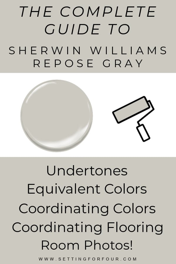
The Complete Beginners Guide to SW Repose Gray
Sherwin-Williams Repose Gray is one of the most popular warm gray paint colors because it is soft, versatile, and easy to use in many rooms of the home.
This beginner’s guide to SW Repose Gray will help you understand its undertones, coordinating colors, lighting effects, and the best rooms and finishes to pair with it.
PIN THIS AND SAVE IT FOR LATER!
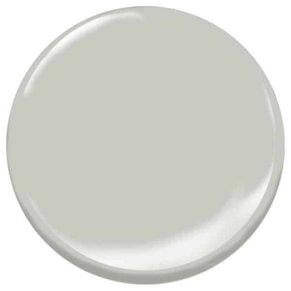
Repose Gray Paint Color Sample – A Close Look
This Sherwin-Williams Repose Gray paint color sample gives you a closer look at the soft, warm gray tone of SW Repose Gray.
It’s a versatile neutral paint color with subtle violet gray undertones that can shift depending on your lighting, surrounding finishes, and decor.
Be careful with Sherwin-Williams Repose Gray because it is a chameleon paint color that can change noticeably depending on your lighting, room exposure, and surrounding finishes!
In some spaces, Repose Gray can show more green or blue undertones, which is why it is so important to test it in your home before making a final paint color decision.
What Color is Repose Gray?
Repose Gray is best described as a “greige”—a mix of gray and beige that creates a warm, balanced neutral color.
It has a violet gray undertone that pairs effortlessly with natural textures, wood tones, and soft whites.
Its popularity comes from its versatility, as it can serve as a backdrop for modern, transitional and traditional homes and can work with many different design styles and decor accent pieces.
It has sophistication and creates a cozy atmosphere.
But beware! This color is a chameleon and it’s appearance in a space is heavily influenced by lighting, which can bring out its undertones and make it look green, purple or blue!
Why You Should Test Repose Gray Before You Paint
Don’t forget to test this color before making your final selection!
I recommend these large Peel & Stick Paint Samples – they are an easy, mess-free way to test paint colors
Need help selecting the perfect interior or exterior paint colors for your home?
Or need help selecting a whole home color palette?
I’m a Designer and True Color Expert® – I can help!
See my Virtual Interior Design Services, Portfolio and Client Reviews
Contact me for a free quote.
I’d love to work with you!
Is Repose Gray a Popular Color?
Repose gray is a very popular paint color!
It’s Sherwin Williams fifth most popular selling paint color!
What is the Undertone of Repose Gray?
This beautiful greige has violet gray undertone.
However it’s a chameleon, complex color and can have a green-gray undertone or a blue-grey undertone depending on the lighting in the room.
So it’s very important to test this paint color in your room!!!
Design tip: Learn these undertone lessons
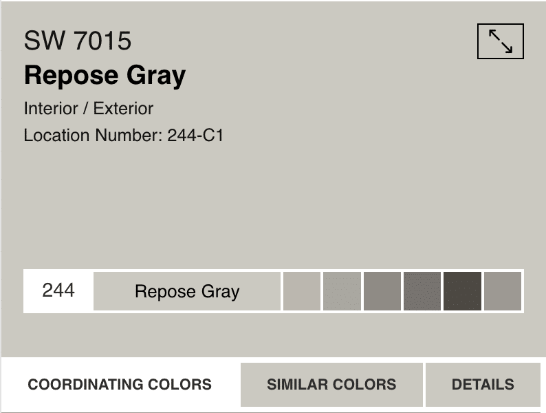
What is the LRV of Repose Gray?
Sherwin Williams Repose Gray has an LRV of 58.
LRV, or Light Reflectance Value, measures the percentage of light a paint color reflects.
It’s a number to assign how light or dark a paint color looks on a scale of 0 (black) to 100 (white).
The higher the LRV number is, the lighter the color is.
The lower the LRV number is – the darker the color is.
So an LRV of 58 means that SW Repose Gray is a light color that reflects a decent amount light.
You need to test it in your room however, to see how it looks with your rooms lighting!
And remember! A light paint color will not necessarily lighten up a room or work in a dark room!
Repose Gray RGB, Hex and LRV Details
- R: 204 G: 201 B: 192
- Hex Value: #CCC9C0
- LRV: 58.22
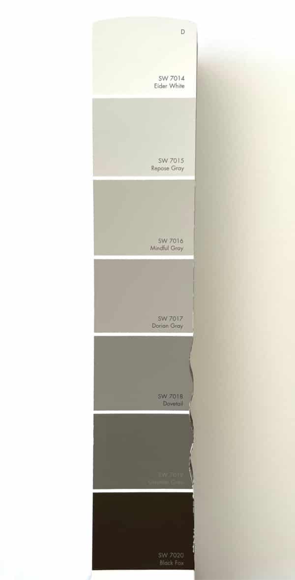
Where Repose Gray Falls on the Color Strip
Sherwin-Williams Repose Gray sits on the lighter side of the color strip, making it a soft and versatile warm gray paint color.
Compared to the deeper shades on its strip, Repose Gray feels airy and balanced while still giving a room gentle depth and warmth.
Is Repose Gray A Warm Or Cool Color?
Repose Gray is a warm gray neutral paint color.
It’s not a cold or sterile grey.
It pairs well with other warm colors.
Repose Gray paint strip:
Does Repose Gray look different in different lights?
Yes — Sherwin-Williams Repose Gray can look different throughout the day and from room to room depending on your lighting and exposure.
Repose Gray In Low Light Rooms
In darker rooms it creates a moody look.
To compliment a moody vibe add accessories in earthy tones, that have a natural touch.
Repose Gray in Light Filled Rooms
In light filled rooms Repose Gray adds a subtle light kiss of griege.
Repose Gray In North Facing Rooms
North facing rooms have a cool blue color which makes RG look more cool and gray.
Repose Gray In South Facing Rooms
South facing rooms have a warm orange-yellow color which makes RG look more warm and more beige.
Is Sherwin-Williams Repose Gray Still Popular?
Repose Gray has had a long history of being a popular color with homeowners.
It’s currently the 5th most popular color sold at Sherwin Williams!
(Sherwin William’s most popular griege is Agreeable Gray )
However, the current paint color trends are leaning toward more warm beiges, warm whites and earthy colors.
So Repose Gray isn’t as trending as it once was.
But it’s still a popular color.
Repose Gray is a color that I still see used as a whole home paint color in new home builds.
And it’s still a popular color for kitchen cabinets and mudroom cabinets!
It has just the right touch of warmth that’s popular in cabinetry today.
It’s also one of Studio McGee’s favorite gray paint colors.
Advice from Sue Wadden, Director Of Color Marketing At Sherwin Williams
Sue Wadden the Director of Color Marketing at Sherwin Williams says: “I love Repose Gray because it’s a true, neutral gray that has always been a top seller. It pairs well with textures and finishes, making it the perfect blank canvas for any space.”
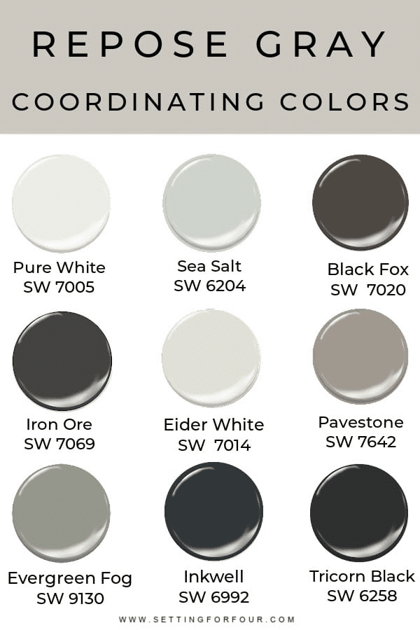
Repose Gray Coordinating Colors
Here are Repose Gray’s coordinating colors that you can use as a whole home color palette:
- SW Pure White is a beautiful coordinating white
- Eider White complements Repose Gray
- SW 7048 Urbane Bronze
- Dark blues like SW Indigo and SW Naval. These colors have rich, cool undertones that really compliment!
- Coral Pink like SW Coral Clay
- Green like Sherwin Williams Evergreen Fog and Behr Back To Nature Paint Color
- Dark Gray like SW Pavestone and SW Iron Ore
- Tricorn Black creates the perfect balance of contrast
These coordinating colors create an inviting atmosphere that’s stylish!
I recommend not pairing Repose Gray with brown grays like SW Dovetail which is another chameleon color. It will create too many clashing undertones.
Design Tip: Using a rug in the room that has features Repose Gray color and a couple of these coordinating colors will really pull a room together!
Best Coordinating Trim Colors For Repose Gray
- Sherwin Williams Pure White
- SW Snowbound
- SW Extra White
See 5 Best White Trim Paint Colors to coordinate with any paint color.
Quick and Easy Ways to Update Repose Gray In Your Home
If you have Repose Gray walls you may be wanting to update it.
Before repainting you can try these easy updates:
- Add this stunning rug that pairs beautifully with it, to make the room look cohesive!
- Add moody art in earthy colors for beautiful contrast
- Add vintage landscape art with green and neutral colors
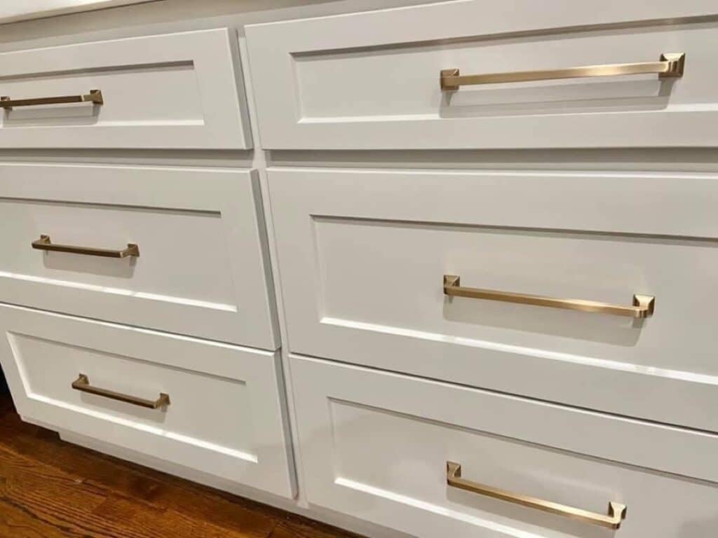
- Add champagne bronze cabinet hardware to kitchen and bathroom cabinets! These cabinet handles also pair with Delta’s champagne bronze faucets!
- Add white or oatmeal colored curtains – they will make repose gray walls pop
- Add a pop of color with:
- earthy brown and neutral pillows and accent furniture
- dark greens in artwork, decor and pillows
- Add ivory and cream throw blankets and accent pillows
- Add black accents. Black compliments greige and is a current color trend.
- add black door hardware
- add black hardware to your kitchen cabinets
- add black light fixtures
If all else fails hire me for an online design consult!
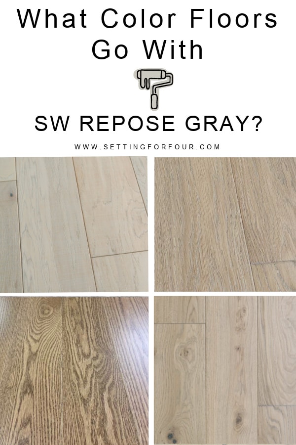
Floor Colors that Coordinate with Repose Gray
It looks beautiful with dark brown floors such as espresso brown stain and walnut stained flooring.
This color pairs well with gray flooring as long as the gray flooring undertone works with RG.
It also looks beautiful with mid toned oak flooring – depending on how much yellow, orange and brown is in the flooring color.
RG looks beautiful with ivory wall to wall carpeting.
Repose Gray can be really tricky with the white oak floor trend that is popular now.
Would you like to see how this color looks with your flooring? If so, you can get a peel & stick paint sample of Repose Gray here!
Color Resources To Help Pick Paint Colors:
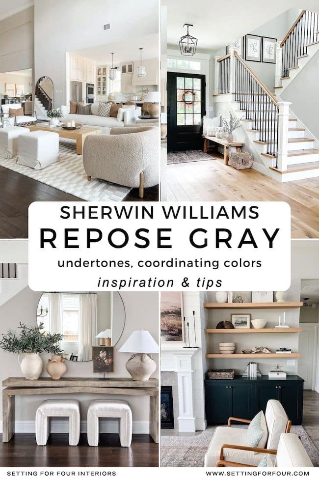
Repose Gray Real Room Examples
Looking for Repose Gray real room examples? Seeing Sherwin-Williams Repose Gray in actual homes is one of the best ways to understand how this popular gray paint color really looks.
These beautiful spaces show how versatile Repose Gray can be in a variety of rooms and lighting conditions. It’s a soft, warm gray paint color that can work beautifully in homes with both modern and traditional style.
If you have a north-facing room or a space with cool natural light, Repose Gray is especially worth considering. North-facing rooms tend to bring in cooler, bluer light, which can sometimes make a space feel darker, flatter, or a little chilly.
Because Repose Gray has subtle warmth, it can help soften that cool light and create a room that feels more balanced, calm, and inviting.
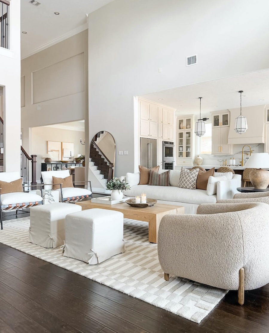
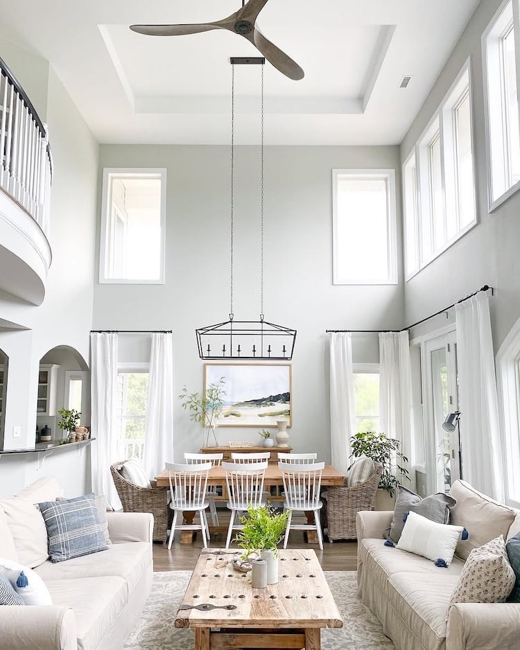
Repose Gray Whole Home Paint Color
Sherwin-Williams Repose Gray is a beautiful whole home paint color and is stunning in open concept spaces.
With plenty of natural light, Repose Gray looks soft and airy in this light-filled home, and it pairs beautifully with neutral decor, black accents, dark brown wood flooring, light white oak wood accent furniture and a dark brown and black staircase for a warm, cohesive look.
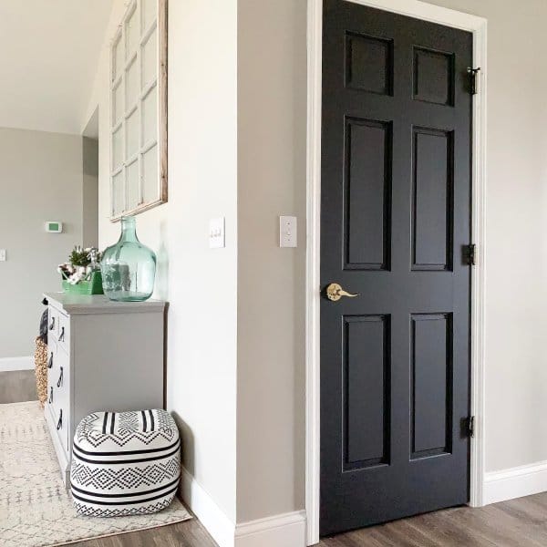
Repose Gray Entryway Ideas
A Repose Gray entryway is a beautiful way to create a welcoming first impression in your home. Since an entryway sets the tone for the rest of the house, choosing a paint color that feels soft, timeless, and easy to coordinate with is especially important.
Sherwin-Williams Repose Gray works well in entryways because it is a warm gray paint color with gentle undertones that can feel calm and elegant without looking too dark. It pairs beautifully with white trim, black accents, warm wood tones, and brushed gold or matte black hardware, making it a versatile choice for many decorating styles.
In an entryway with limited natural light, Repose Gray can add depth and softness without feeling heavy. In a brighter foyer, it can look clean, refined, and airy. This makes it a smart choice if you want an entryway paint color that feels classic but still current.
If you’re looking for an entryway paint color that coordinates well with surrounding rooms and creates a cohesive flow throughout your home, Repose Gray is a strong option to consider.
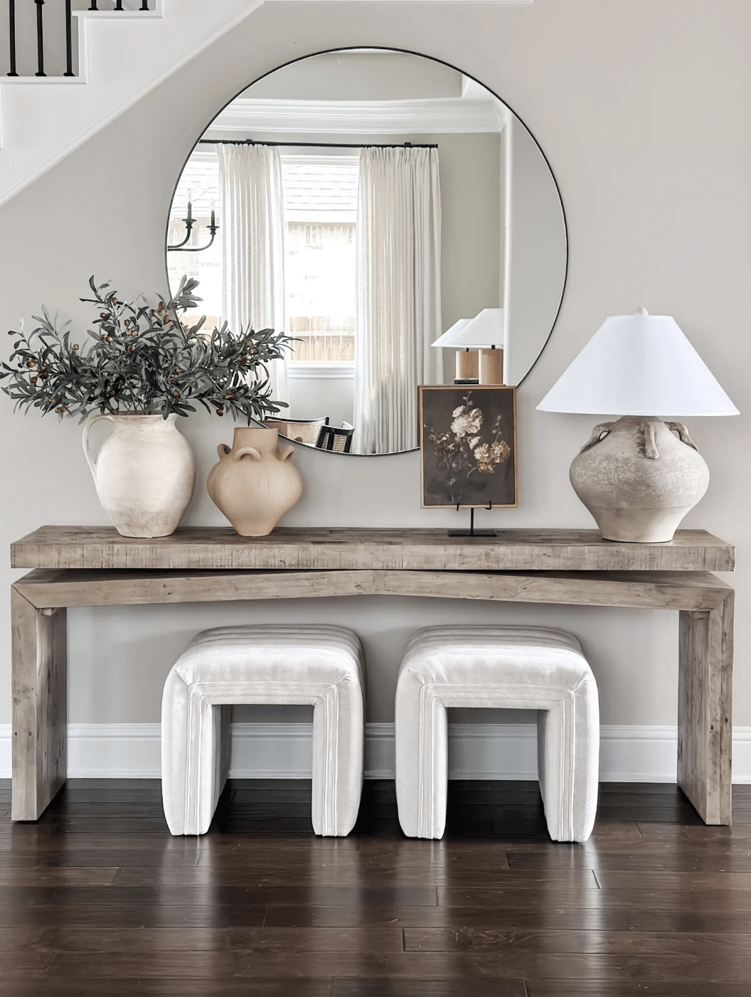
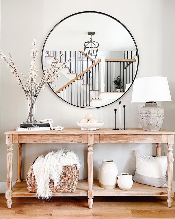
Repose Gray walls with an interior door painted SW Tricorn Black:
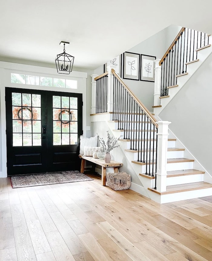
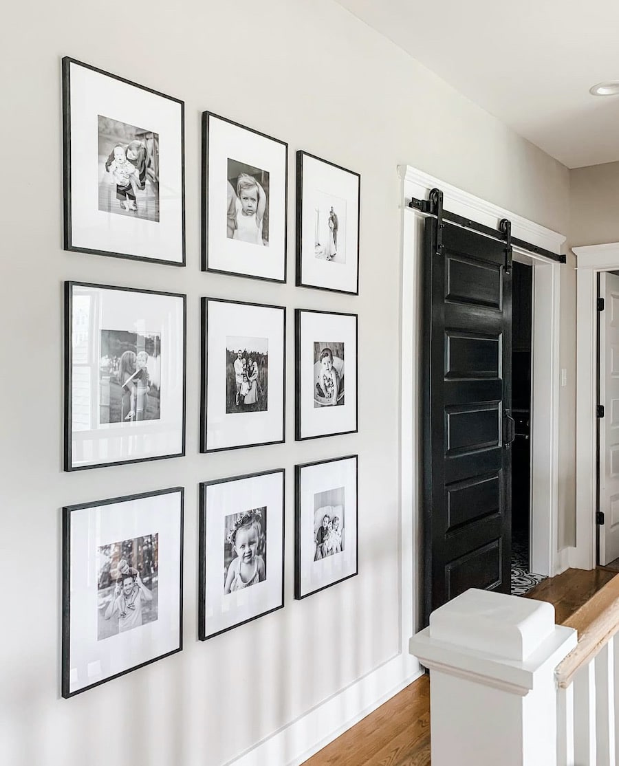
Repose Gray Hallway Inspiration
A Repose Gray hallway is a beautiful way to create a soft, cohesive flow between rooms.
Sherwin-Williams Repose Gray is a popular warm gray paint color because it feels calm, versatile, and easy to coordinate with many home styles and finishes.
Hallways can often feel dark, narrow, or overlooked, especially when they have limited natural light. Repose Gray helps add gentle warmth and depth without making the space feel too heavy. Its subtle undertones make it a great choice for connecting nearby rooms while keeping your home feeling light, balanced, and inviting.
If you are looking for a hallway paint color that works with white trim, wood flooring, black accents, and warm neutral decor, Repose Gray is an excellent option. It can give a hallway an updated look while still feeling timeless and easy to live with.
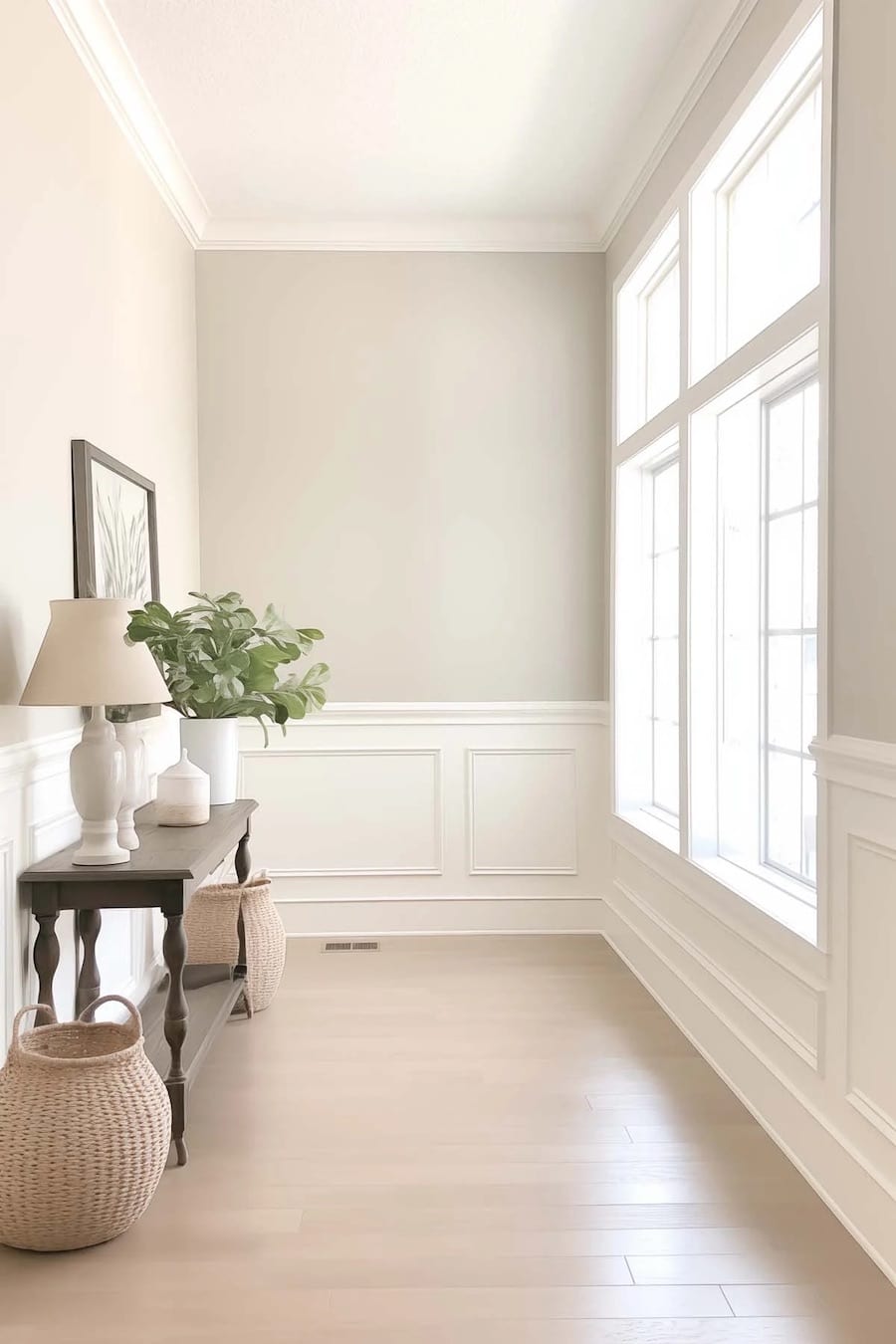
Repose Gray With White Wainscoting
Repose Gray with white wainscoting creates a classic, elegant look that feels fresh and timeless.
The soft warmth of Sherwin-Williams Repose Gray pairs beautifully with crisp white trim and wainscoting, adding contrast while keeping the space light and cohesive.
This combination works especially well in entryways, hallways, dining rooms, and living spaces where you want a refined, polished feel.
This room featuring Sherwin Williams Repose Gray wall color with SW Alabaster wainscoting, trim and crown molding paint color – such a classic look!
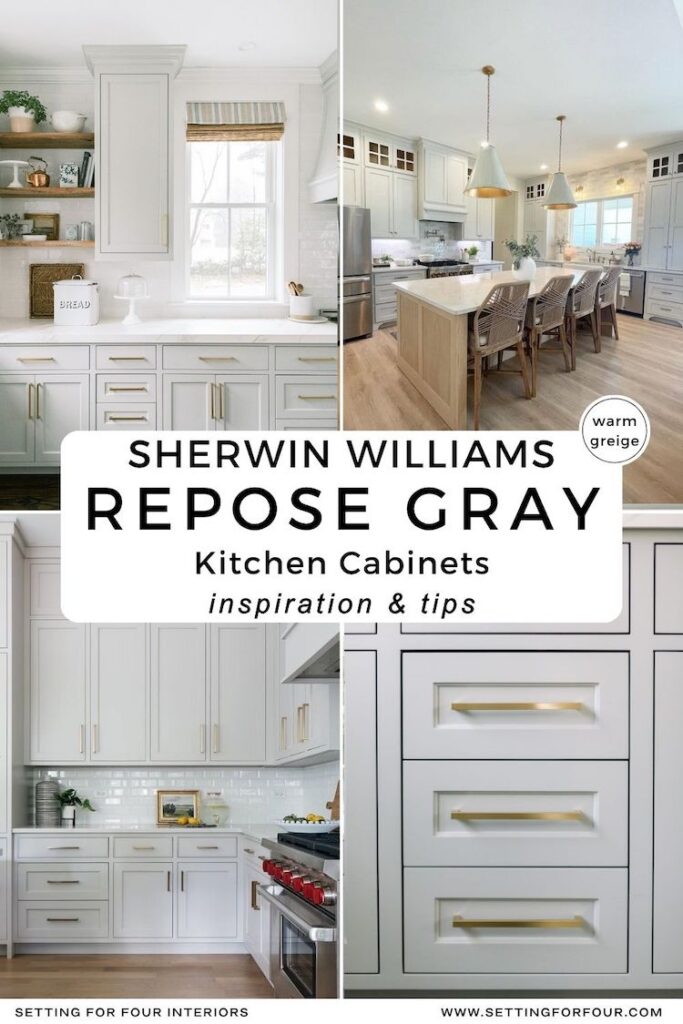
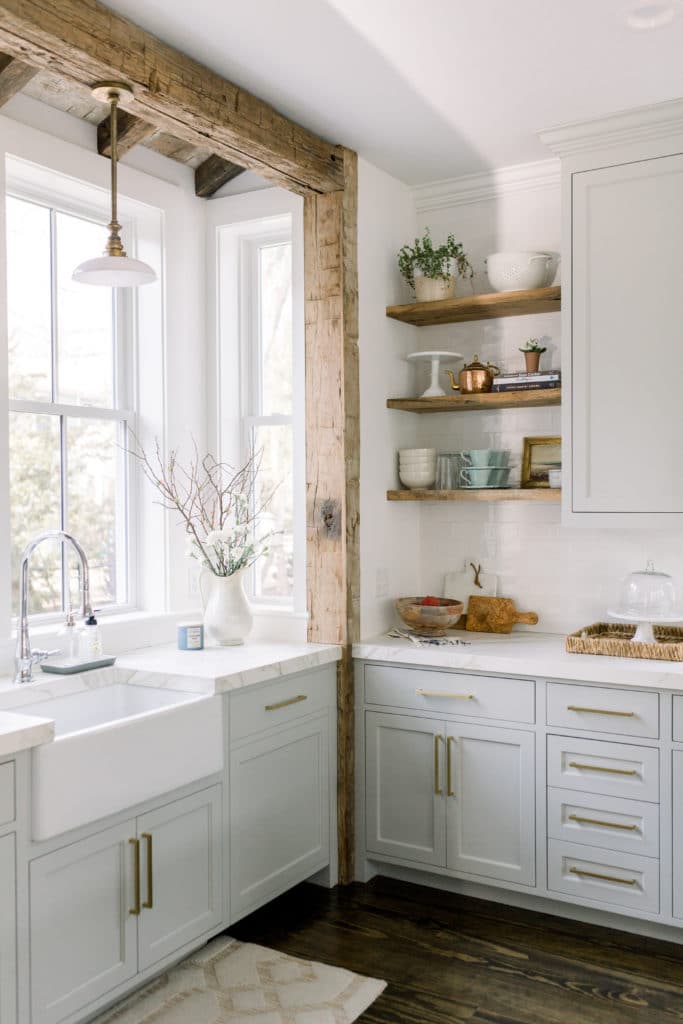
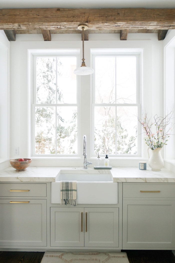
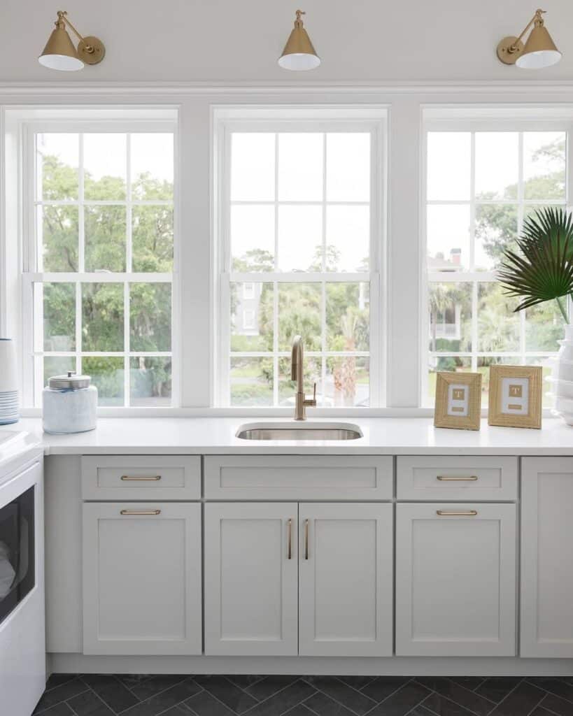
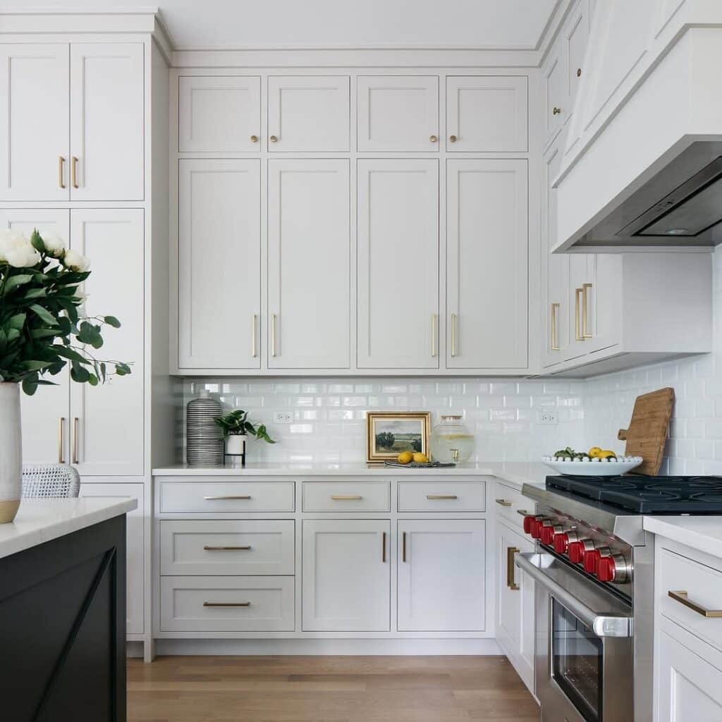
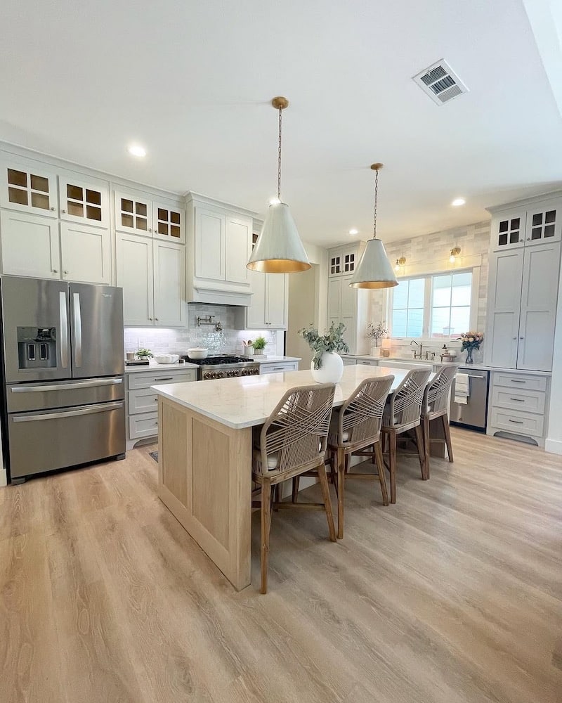
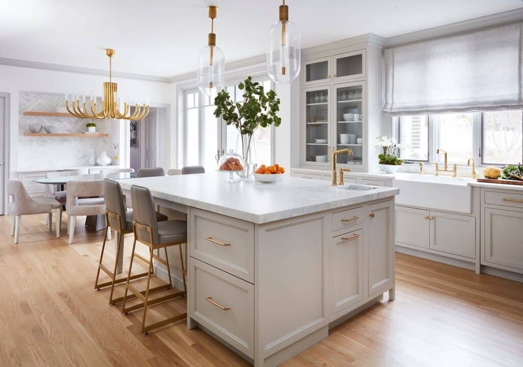
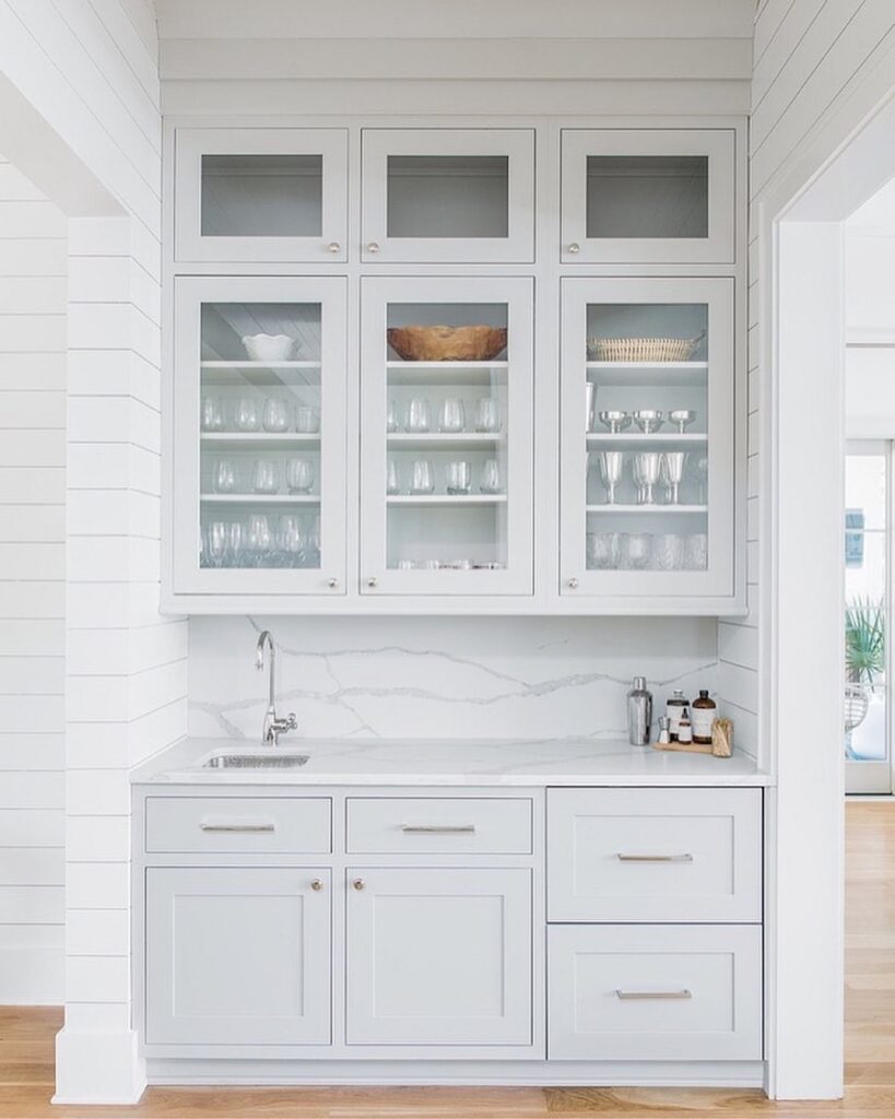
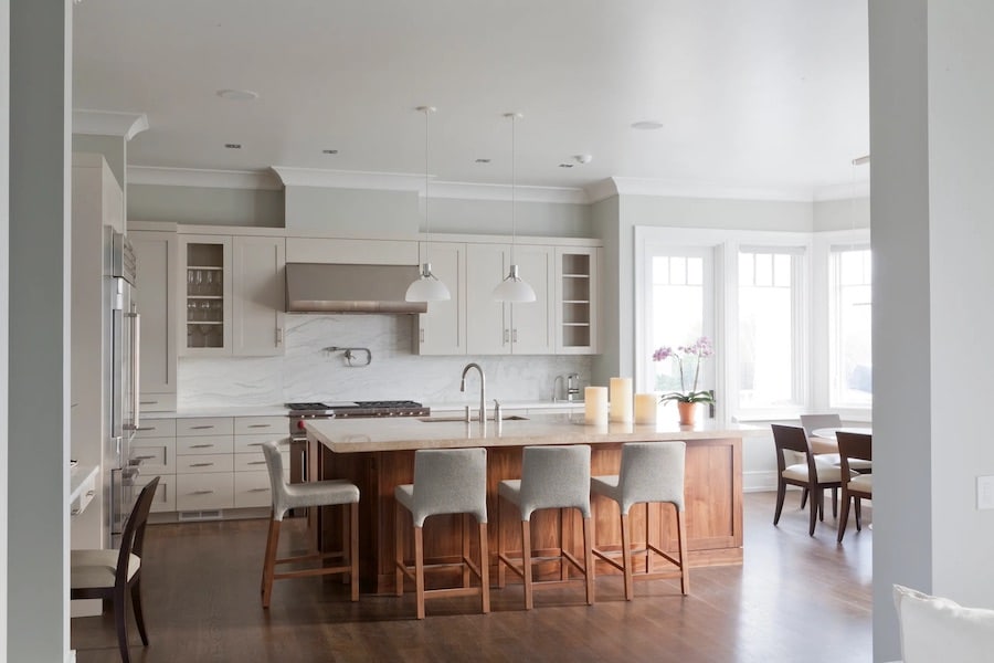
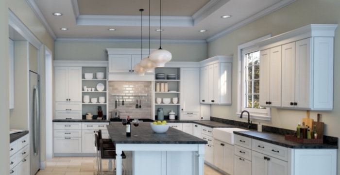
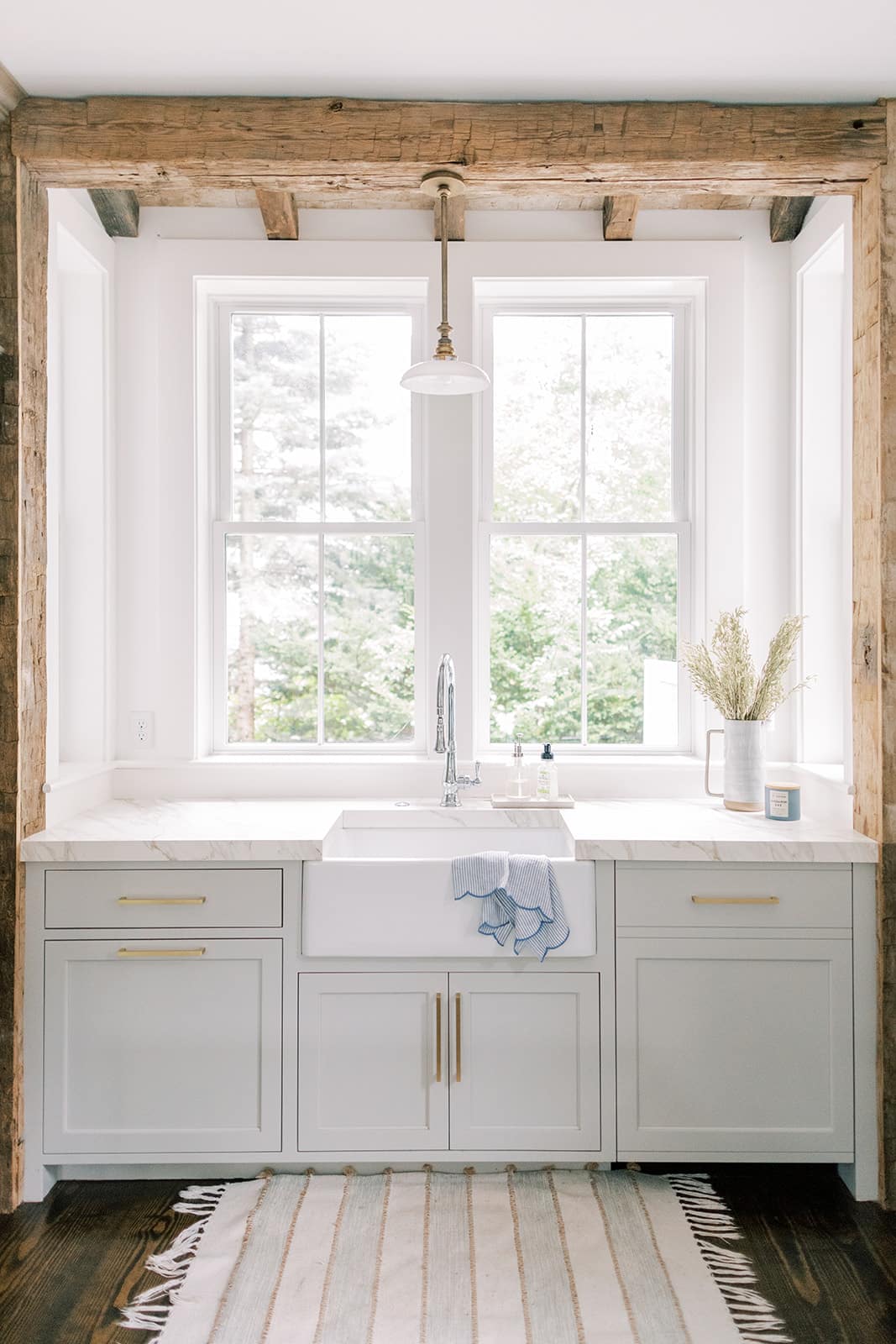
Repose Gray Kitchen Cabinets
Repose Gray is a gorgeous warm gray cabinet paint color to create the perfect greige kitchen that’s on trend and so popular!
It feels soft and timeless.
For homeowners who want a neutral cabinet color that works with both classic and modern finishes, Repose Gray kitchen cabinets are a versatile choice.
If you are looking for Repose Gray kitchen cabinet ideas, these kitchens are a beautiful example of how Sherwin-Williams Repose Gray can look on cabinets.
Get a peel & stick paint sample of Repose Gray here.
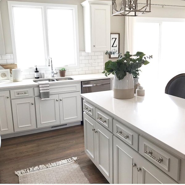
Repose Gray is the kitchen cabinet paint color in this popular Instagram and Pinterest kitchen!
Repose Gray cabinets look especially beautiful paired with the rustic reclaimed wood, white accents, and quartz countertops. The mix of warm wood and crisp white finishes helps highlight the subtle warmth of Repose Gray and creates a kitchen that feels inviting, balanced, and stylish.:
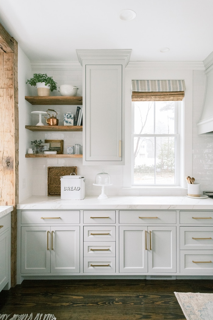
Repose Gray Kitchen Cabinets via Finding Lovely
Repose Gray Pantry Cabinets
Repose Gray pantry cabinets are a beautiful way to add soft color and warmth to a kitchen or butler’s pantry. Sherwin-Williams Repose Gray is a versatile warm gray paint color that works especially well on cabinetry because it feels timeless, elegant, and easy to coordinate with surrounding finishes.
On pantry cabinets, Repose Gray can add depth without feeling too dark or heavy. It pairs beautifully with white walls, marble countertops, warm wood accents, black hardware, and brushed gold finishes, making it a great choice for both classic and modern kitchens.
If you are looking for a pantry cabinet paint color that feels refined, neutral, and designer-approved, Repose Gray pantry cabinets are a smart option. It’s a beautiful choice for creating a pantry space that feels polished and cohesive with the rest of the kitchen.
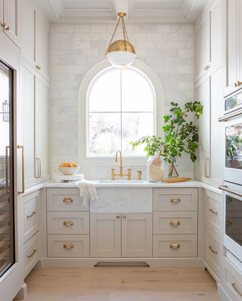
Pantry – Repose Gray cabinetry paint color via Jaimee Rose Interiors
Repose Gray Kitchen Walls
Sherwin-Williams Repose Gray kitchen walls are a beautiful choice if you have white kitchen cabinets and wood floors. This soft, warm gray paint color adds gentle contrast and depth while still helping a kitchen feel light, fresh, and inviting.
Repose Gray in a kitchen can look especially beautiful when it is paired with the right finishes. Because Repose Gray has subtle undertones, your countertops, backsplash, and flooring should coordinate well so the whole space feels cohesive. When everything works together, Repose Gray can create a timeless kitchen that feels calm, elegant, and easy to live with.
If you are looking for a warm gray kitchen paint color that works with white cabinetry and natural wood tones, Repose Gray kitchen walls are a versatile option to consider.
See – How to Mix Design Styles So They Don’ Clash!
SW Repose Gray kitchen walls with SW Eider White Cabinets
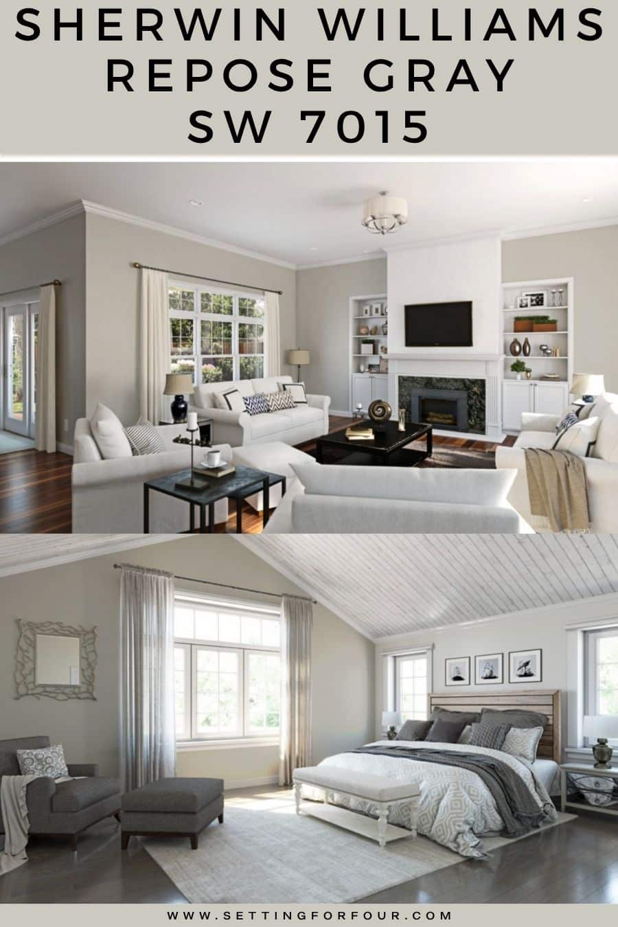
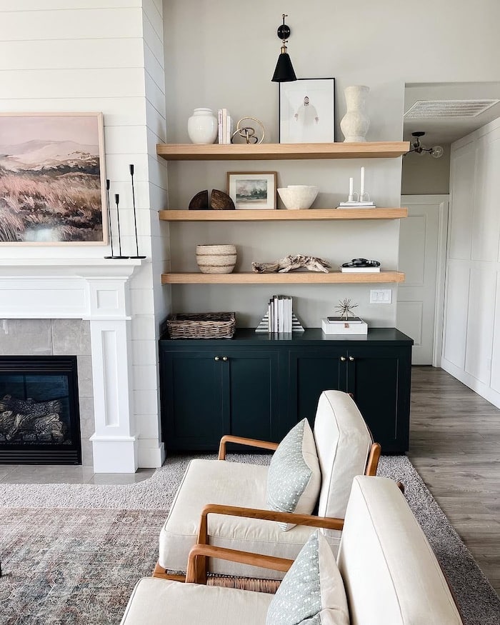
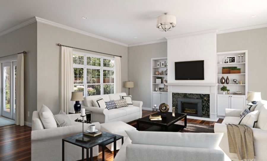
Repose Gray Living Rooms
Sherwin-Williams Repose Gray living room walls are a beautiful choice for creating a warm, cozy, and inviting space. Repose Gray is a soft warm gray paint color that adds depth while still keeping a living room feeling light, calm, and timeless.
When using Repose Gray in a living room, it is important to make sure it coordinates well with your furniture, area rug, fireplace tile, brick, and wood tones. Because Repose Gray has subtle undertones, the surrounding finishes and decor can affect how the color looks in your space.
If you are looking for a warm gray living room paint color, Repose Gray is a versatile option that works well in both traditional and modern living rooms.
And if your home has a larger connected space, be sure to read my open concept furniture layout guide for tips on arranging furniture in a way that feels functional and pulled together.
Repose Gray living room walls with corner fireplace furniture placement:

Repose Gray great room wall color with white builtin cabinets via Cassie Scaldaferri
Living room walls painted SW Repose Gray via AK Construction
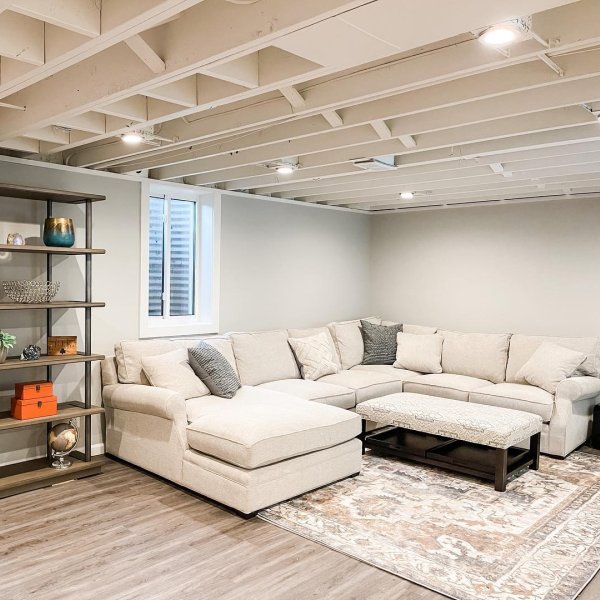
Repose Gray Basement Walls
Sherwin-Williams Repose Gray basement walls are a beautiful choice for a basement living room.
This soft warm gray paint color pairs beautifully with LED pot lights and white trim, helping a basement feel brighter, warmer, and more inviting.
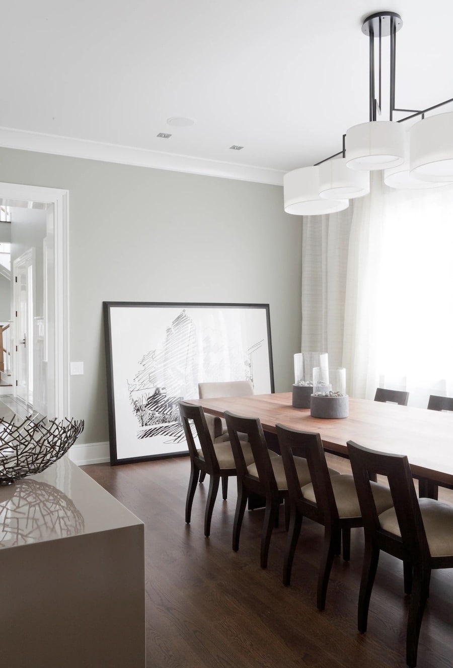
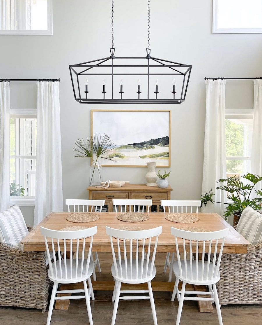
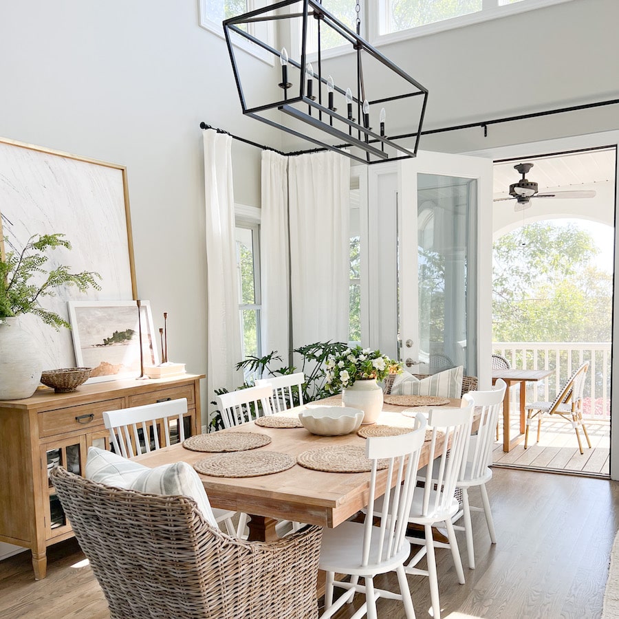
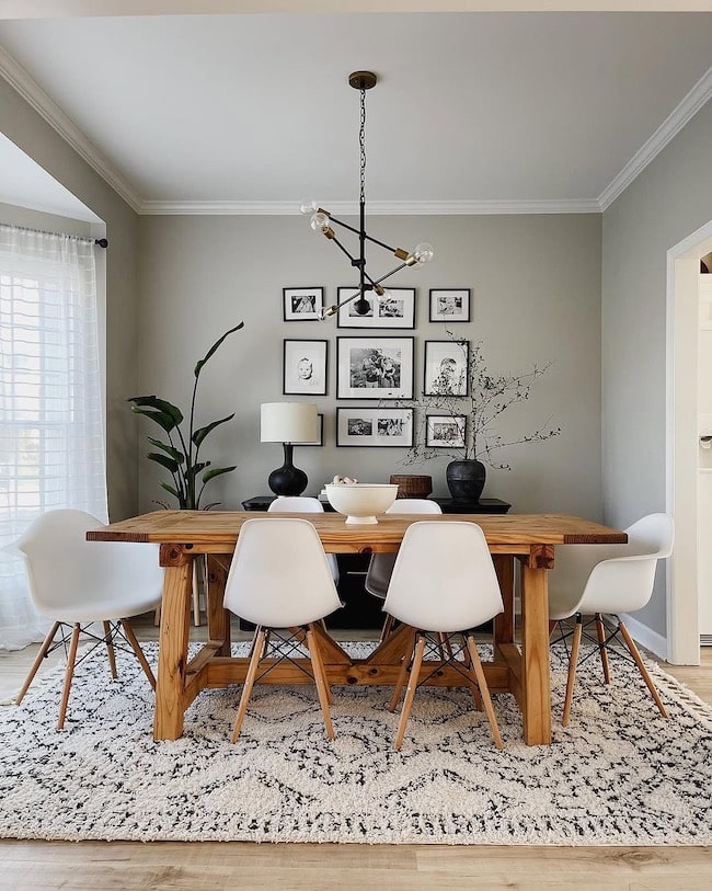
Repose Gray Dining Room Inspiration
Sherwin-Williams Repose Gray is a beautiful dining room paint color that creates a soft, elegant, and inviting look. Its warm gray tone works especially well in dining rooms, adding depth while still keeping the space light and timeless.
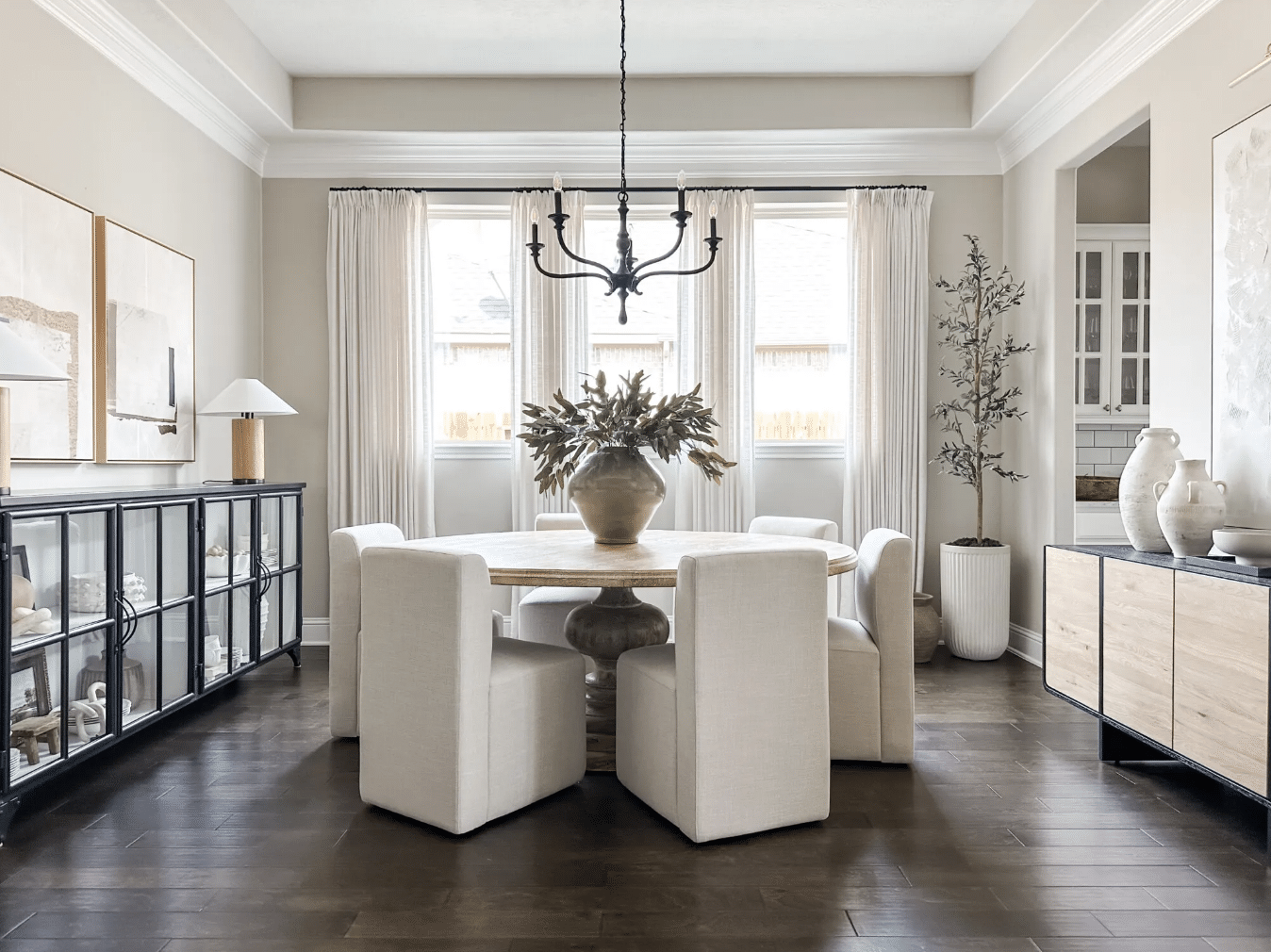
In this eat-in kitchen dining nook, Repose Gray compliments the wood dining table and black arch cabinet!
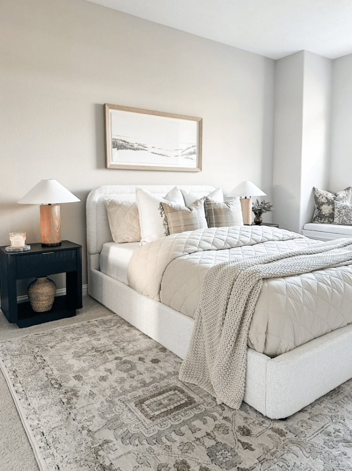
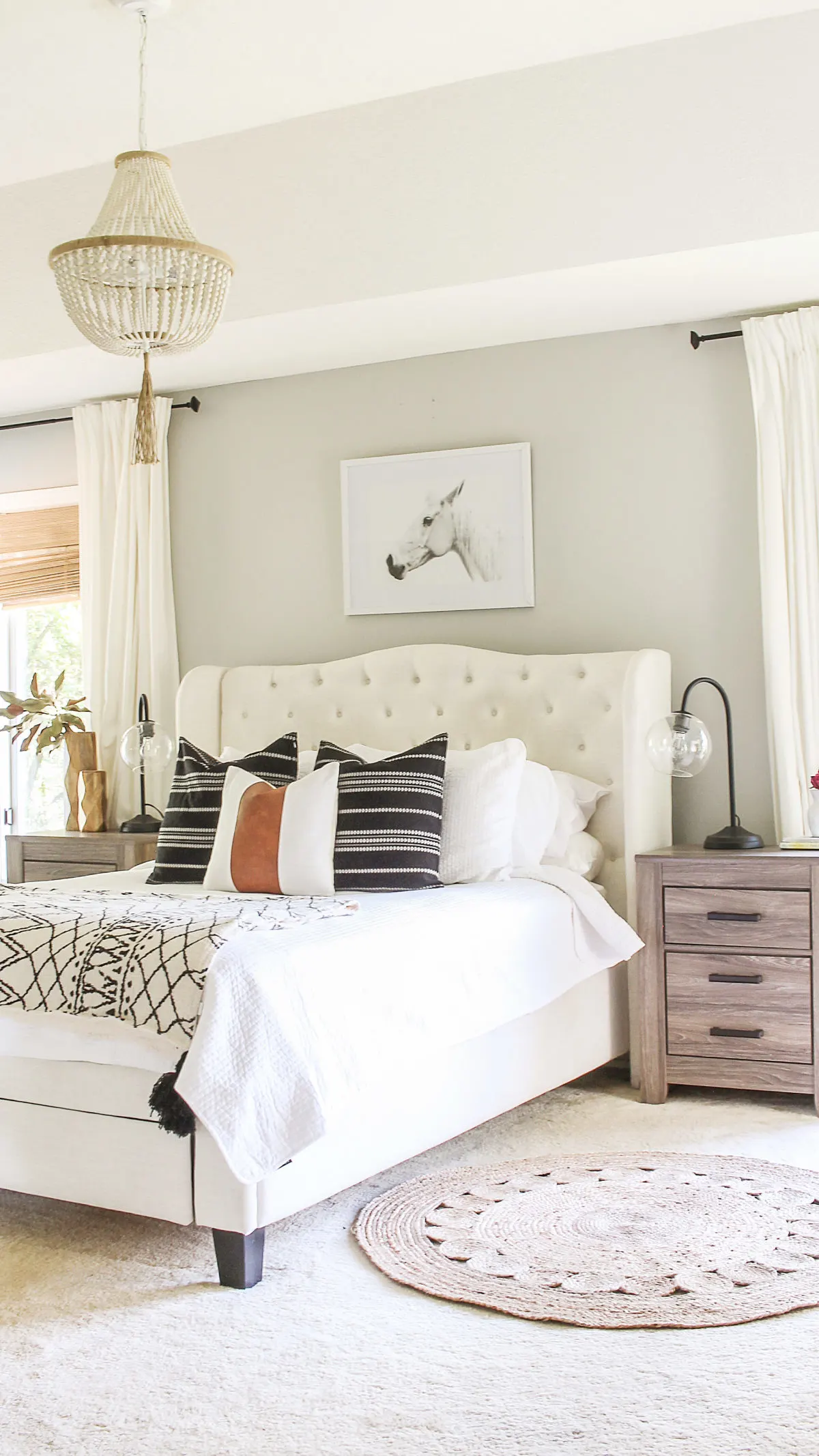
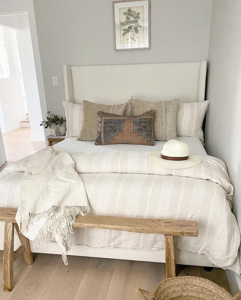
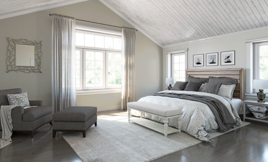
Repose Gray Bedroom Ideas
Sherwin-Williams Repose Gray is a beautiful bedroom paint color for creating a soft, calm, and relaxing space. This warm gray wall color feels neutral, timeless, and easy to coordinate with a variety of bedding, furniture, wood tones, and white trim.
If you are looking for a warm gray bedroom paint color, Repose Gray is a versatile choice that can help a bedroom feel restful, cozy, and inviting.
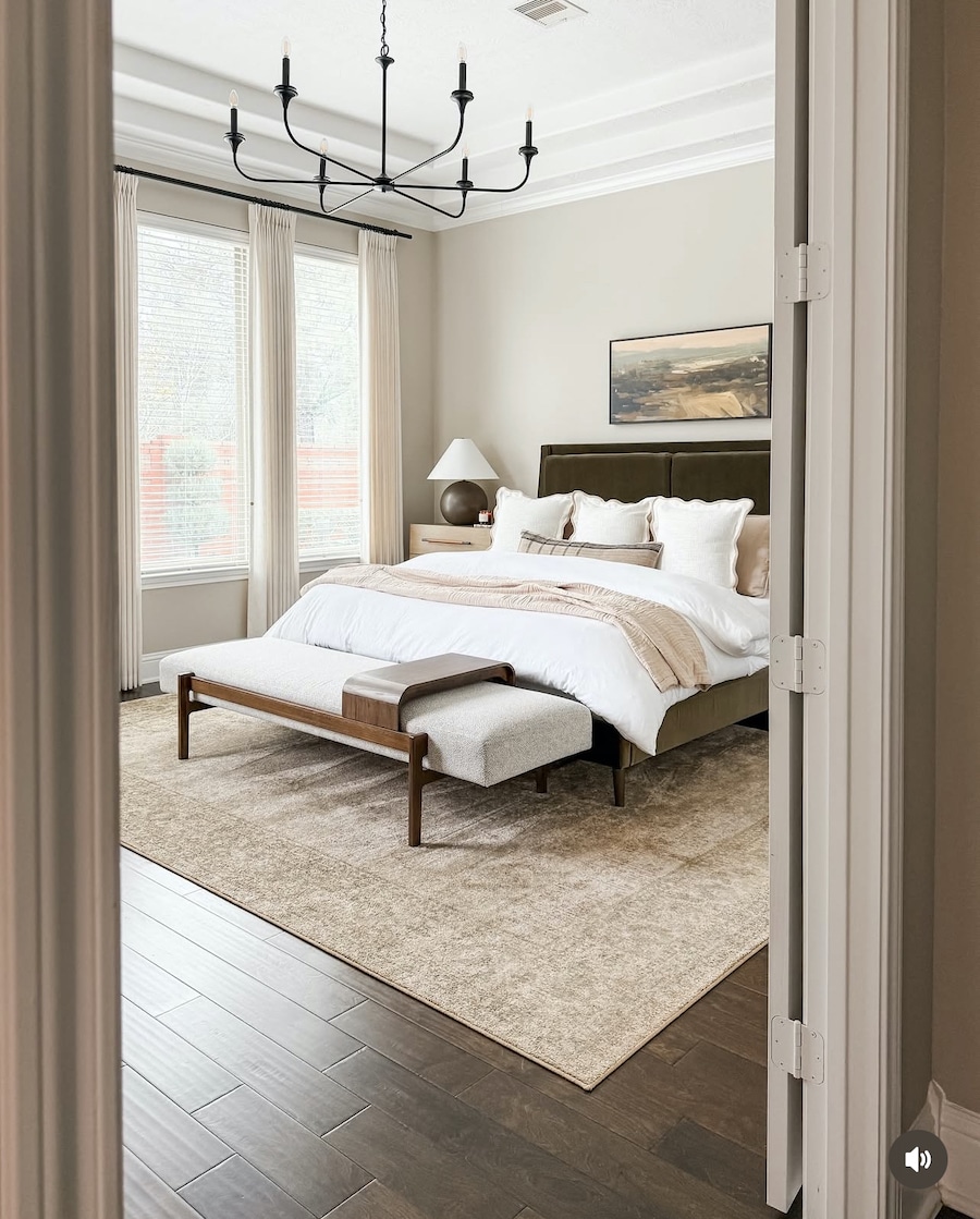
Repose Gray bedroom via Designing Vibes
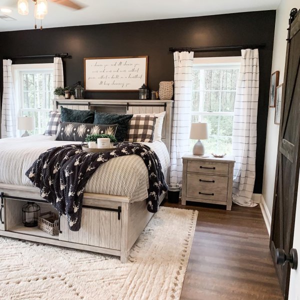
Repose Gray Bedroom With A Black Accent Wall Idea
Sherwin-Williams Repose Gray bedroom walls paired with a Tricorn Black accent wall create a striking, modern contrast.
This paint color combination adds depth and drama while still keeping the bedroom balanced, cozy, and sophisticated.
Repose Gray Kids Bedroom Inspiration
Sherwin-Williams Repose Gray is a beautiful kids bedroom paint color because it feels soft, calm, and easy to grow with.
This warm gray wall color pairs well with pink, blue, and green accents, making it a versatile choice for a child’s bedroom.
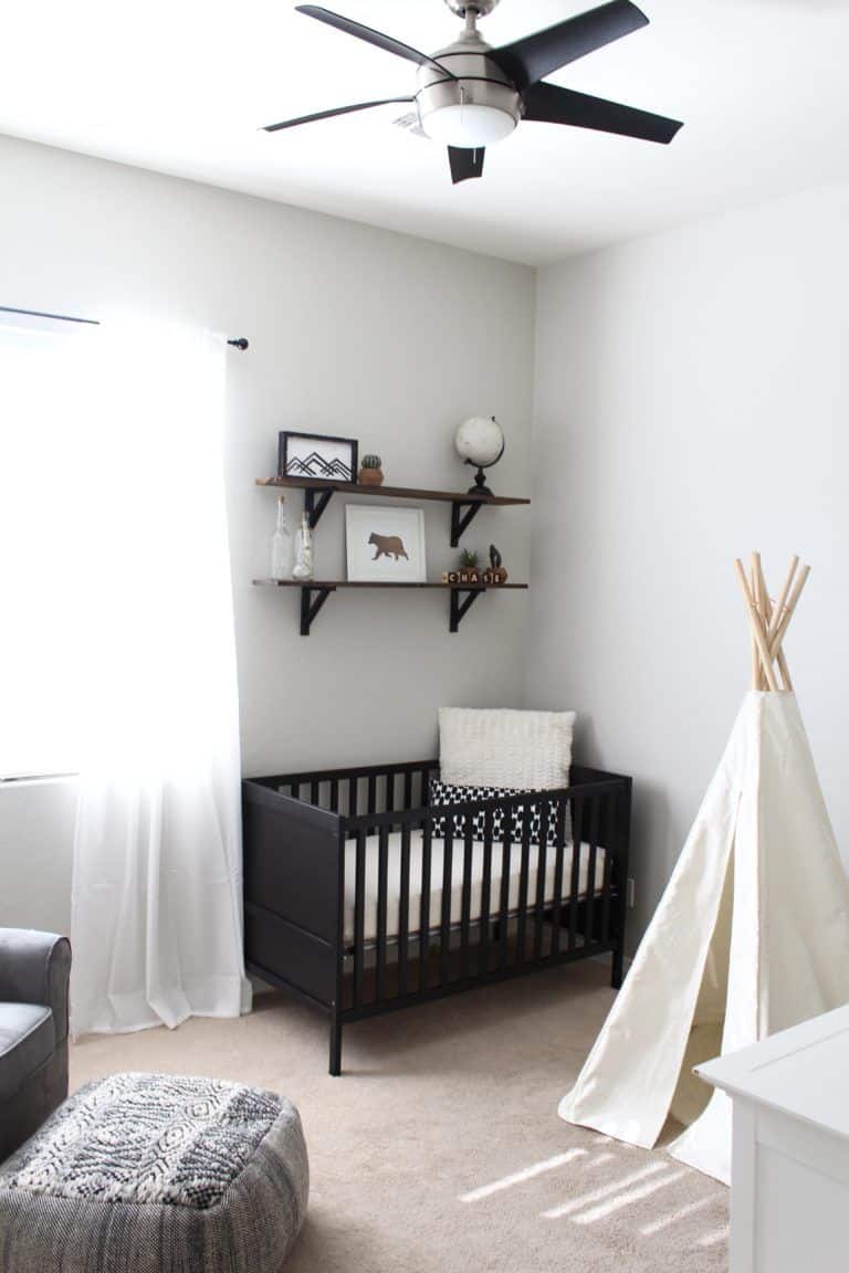
Repose Gray Nursery Idea
Sherwin-Williams Repose Gray is a chic nursery paint color for creating a soft, neutral, and calming space.
This warm greige paint color works beautifully in a nursery and pairs well with white trim, natural wood tones, and muted decor for a timeless look.
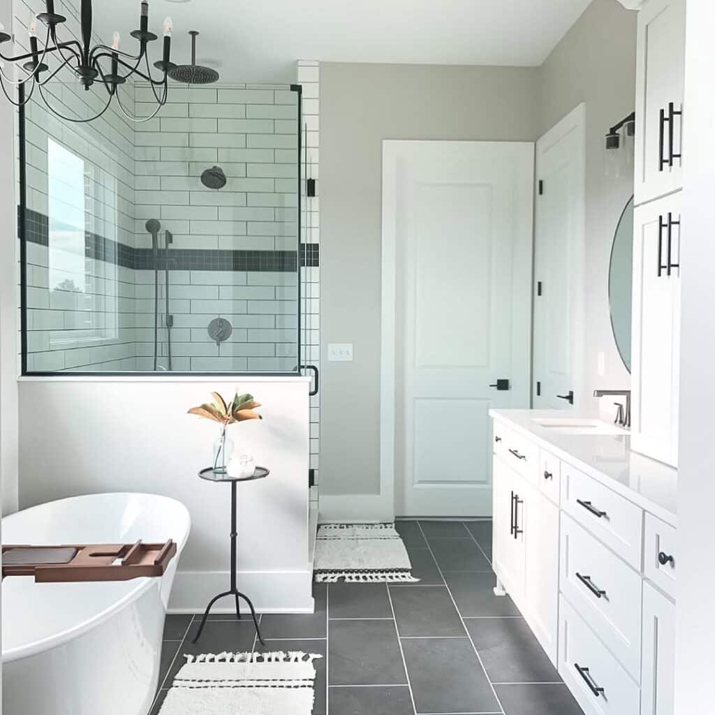
Repose Gray Bathroom Ideas
Sherwin-Williams Repose Gray is a beautiful bathroom paint color for creating a soft, soothing, and timeless look.
This warm gray paint color pairs beautifully with wood bathroom cabinetry, black accents, marble, quartz, and crisp white finishes, making it a versatile choice for many bathroom styles.
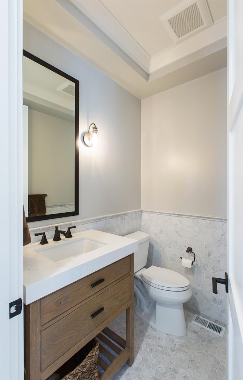
RG bathroom walls via AK Construction
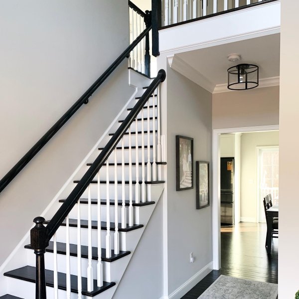
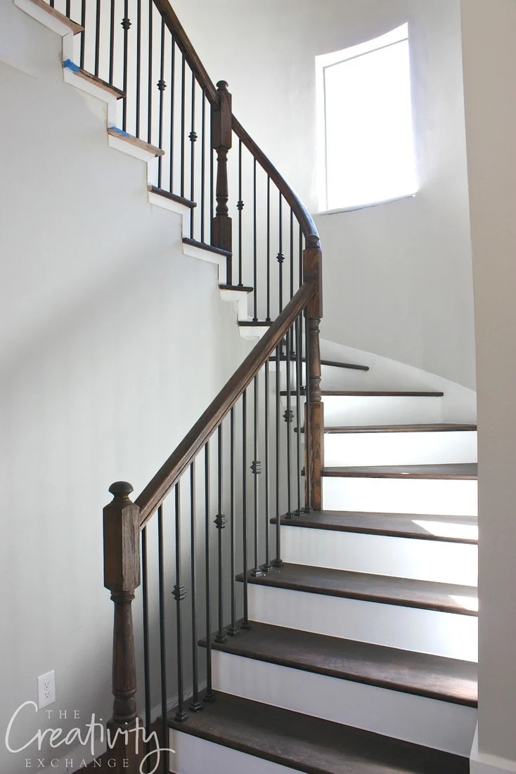
Repose Gray Staircase Wall Ideas
Sherwin-Williams Repose Gray is a beautiful staircase wall color that pairs well with dark brown flooring and brown wood railings. Its soft warmth helps balance rich wood tones and creates a staircase that feels classic, warm, and cohesive.
Repose Gray Doors and Trim
Sherwin-Williams Repose Gray can be a beautiful choice for doors and trim if you want a soft, subtle contrast instead of a crisp bright white look.
Repose Gray works especially well with white walls, warm wood tones, and neutral interiors, creating a refined and cohesive feel.
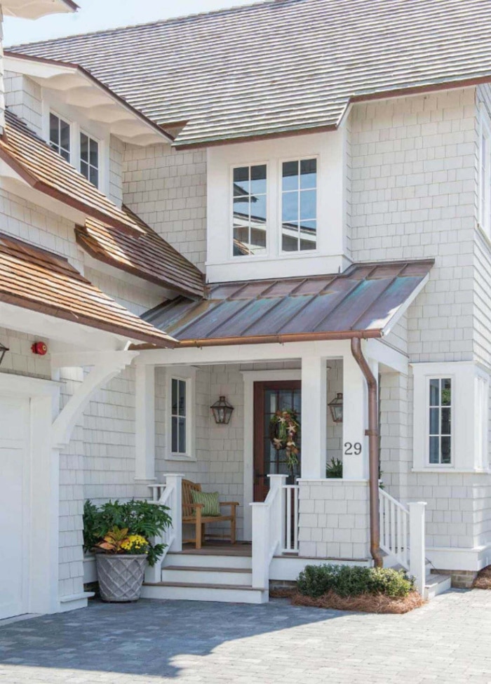
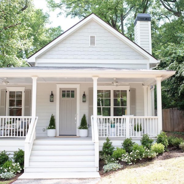
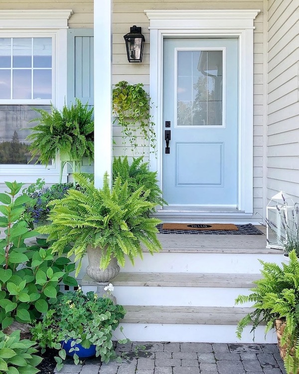
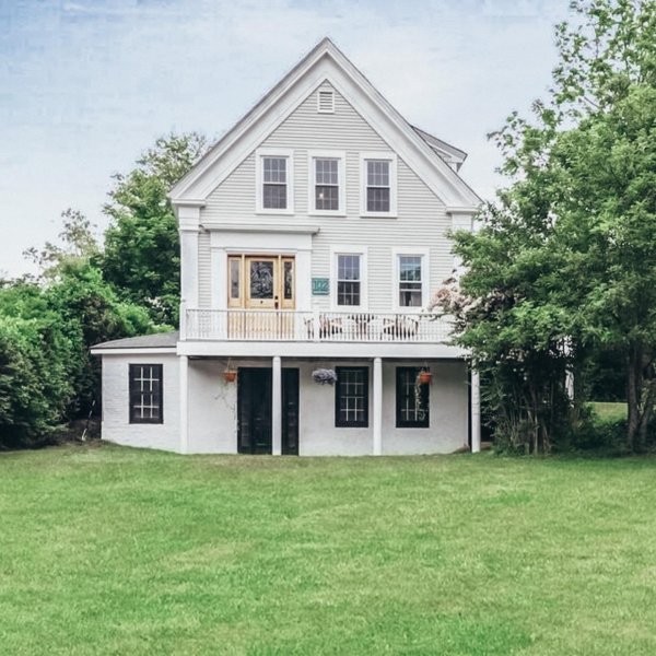
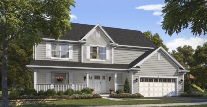
Repose Gray Exteriors
Sherwin-Williams Repose Gray is a beautiful exterior paint color if you are looking for a warm, light greige that works well with landscaping, trees, and natural greenery. This soft neutral exterior color pairs best with black, dark gray, and medium to dark brown roof shingles.
It’s a beautiful exterior color for exterior trim, shutters, siding and front door.
Repose Gray exteriors also look beautiful with white or black shutters, creating a classic and timeless contrast.
For the best result, avoid pairing Repose Gray with roof shingles that have red undertones, since they can clash with its subtle warmth.
If you’re considering Sherwin-Williams Repose Gray for your exterior, you may also want to explore my full guide to the top 50 Sherwin-Williams exterior paint colors to compare undertones, depth, and curb appeal.
Design Tip: The BIG Mistakes You’re Making Choosing A Roof Shingle Color
THis beautiful home has Sherwin Williams Repose Gray exterior shake siding:
RG exterior siding paint color via TS Adams Studio
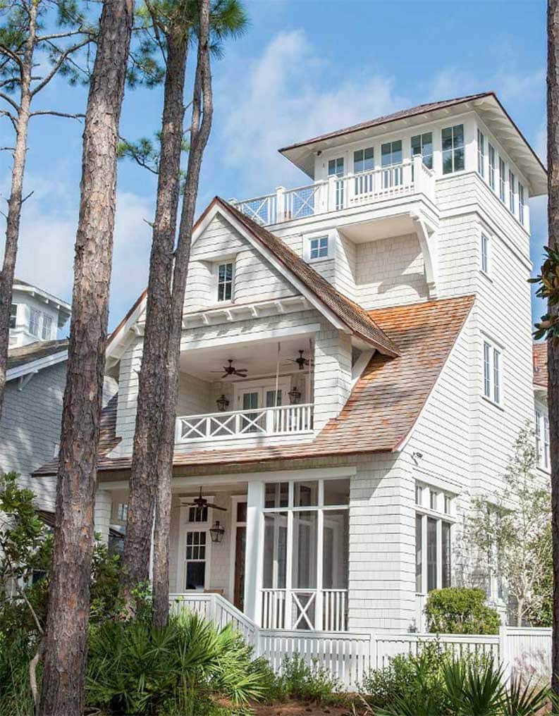
RG – exterior shake shingles paint color via TS Adams Studio

Sherwin Williams RG exterior paint color via PBC Design + Build

RG exterior paint color via PBC Design + Build
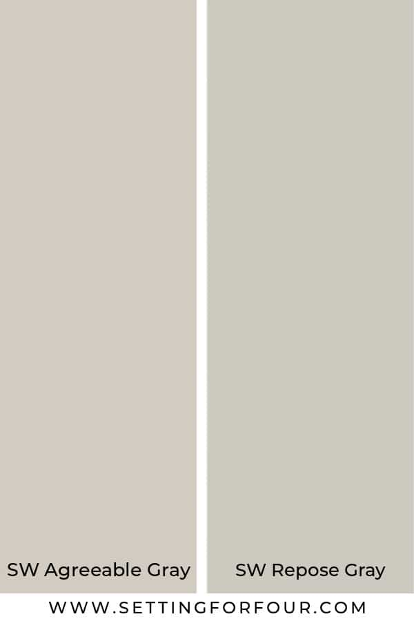
Repose Gray vs Agreeable Gray
Sherwin-Williams Repose Gray is slightly darker and a bit grayer than Agreeable Gray.
While Agreeable Gray has stronger beige undertones that make it a true greige paint color, Repose Gray reads as a softer warm gray.
Repose Gray is also a little cooler than Agreeable Gray, although it is still considered a warm gray paint color.
Get a peel and stick paint sample of Agreeable Gray here!
Repose Gray vs Revere Pewter
Benjamin Moore Revere Pewter and Sherwin-Williams Repose Gray are both popular neutral paint colors, but they have different undertones and depth.
Revere Pewter is more beige and is a bit more warmer than Repose Gray.
Sherwin Williams Revere Pewter has a more green-beige undertone, while Repose Gray has a violet gray undertone.
Design Tip: How To Identify Paint Color Undertones – To Choose The Right Color
Repose Gray reads as a soft warm gray while Revere Pewter reads as a soft warm beige.

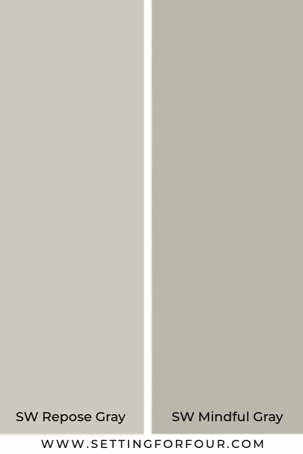
Repose Gray vs Mindful Gray
Both Repost Gray and Mindful Gray are beautiful warm neutral gray colors.
Mindful Gray is a bit darker than Repose Gray.
Both have green undertones and both can flash to purple undertones depending on the lighting in the room.
Get a reusable peel and stick paint sample of SW Mindful Gray here!
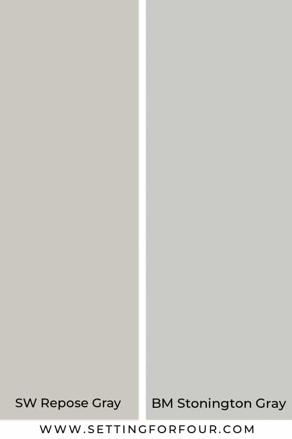
Repose Gray vs Stonington Gray
They are both beautiful gray colors with similar color depth!
BM Stonington Gray is more cool than RG.
Stonington Gray has more blue undertone than RG.
BM Stonington Gray is one of Benjamin Moore’s most popular neutral colors.
They are both timeless, classic colors that are popular and won’t go out of style.
Get a reusable peel and stick paint sample of BM Stonington Gray here!
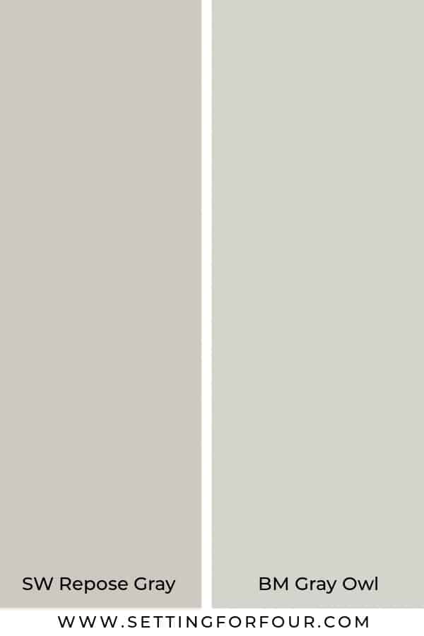
Repose Gray vs Gray Owl
Gray Owl is another very popular gray color at Benjamin Moore.
Both RG and Gray Owl are neutral grays.
Gray Owl is a bit lighter.
Gray Owl has a green undertone that can flash to blue in certain lighting.
Therefore it can look warm or cool depending on the lighting.
Get a reusable peel and stick paint sample of SW Gray Owl here!
Repose Gray vs Dorian Gray
Dorian Gray is similar to Repose Gray because it has a violet gray undertone too!
Both are warm colors.
The difference is that Dorian Gray is darker than Repose Gray.
Frequently Asked Questions about Repose Gray
Is Repose Gray Outdated?
No, Sherwin-Williams Repose Gray is not outdated, but it is a paint color that depends heavily on the finishes and undertones around it. Repose Gray is a soft warm gray paint color that can still look beautiful and timeless when it is paired with the right flooring, countertops, tile, cabinetry, and decor.

Like many popular gray and greige paint colors, Repose Gray may not be the best fit for every home or every fixed finish. In some spaces, it can feel fresh and classic, while in others it can look less current if the undertones clash with the room. The key is making sure Repose Gray coordinates well with your lighting and surrounding materials.
If you are wondering whether Repose Gray is still in style, the answer is yes for the right home. It can still be a beautiful choice for walls, cabinetry, and even exteriors when you want a soft neutral that feels calm, balanced, and versatile.
Which is Better: Agreeable Gray or Repose Gray?
As a Designer and True Color Expert®, I often get asked which neutral is better: Sherwin-Williams Agreeable Gray or Sherwin-Williams Repose Gray.
The truth is, neither one is universally better — the best choice depends on your lighting, flooring, fixed finishes, and the undertones already in your home.
Agreeable Gray is a warmer greige paint color with stronger beige undertones, while Repose Gray is a soft warm gray paint color that reads a little cooler and grayer. If your home has warm finishes and you want a cozier, creamier look, Agreeable Gray may be the better fit. If you want a more neutral, balanced gray that still feels soft and inviting, Repose Gray may work better.
When comparing Agreeable Gray vs Repose Gray, the most important factor is how each color works with your room’s natural light and surrounding materials. A paint color that looks perfect in one home can look completely different in another, which is why undertones matter so much.
When not to use Repose Grey?
Don’t use repose gray if you have other greige colors in the room.
They can create undertone clashing.
I also wouldn’t use orange or yellow with repose gray as it will clash with the violet gray undertone.
Avoid using Sherwin-Williams Repose Gray with other greige paint colors that have different undertones, since this can create undertone clashing in a room.
Repose Gray can also clash with orange or yellow accents because of its subtle violet-gray undertone.
For the most cohesive look, pair Repose Gray with finishes and decor that complement it’s soft, violet gray undertone.
Does Repose Gray look green?
Yes Repose Gray can look green in certain lighting.
Does Repose Gray look purple?
Repose Gray can also look purple in some lighting as well!
It’s a chameleon color that will change quite dramatically depending on the lighting in the room.
Does Repose Gray go with oak cabinets?
Oak cabinets have a brown, yellow and/or orange color which will clash with the purple/green/blue undertones in Repose Gray.
So I recommend that Repose Gray not be used as a kitchen wall color if you have honey oak cabinets.
Sherwin Williams Mindful Gray is a beautiful gray paint color to pair with oak cabinets.
Honey Oak cabinets can vary a great deal with how light/dark they are and how much brown, orange and yellow is in the stain color.
So it’s really important to take your oak cabinet color into consideration when picking wall paint color to coordinate.
Does Repose Gray go with marble?
Yes! This paint color looks beautiful with white marble with some gray/greige veining in it.
Just make sure the undertones of Repose Gray and the marble work well together!
Repose Gray bathroom walls with marble tile
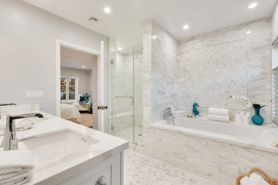
Repose Gray Bathroom with marble tile floor, tub surround and shower via Zillow
What white paint goes with Repose Gray?
Sherwin Williams Pure White is the perfect white to go with RG because it’s a fresh clean white with no undertones.
So you don’t have to worry about any undertones clashing with the undertones in Repose Gray!
Get your peel and stick paint sample of SW Pure White here.
Sherwin Williams Extra White also works well with RG.
Sherwin Williams Alabaster which is a creamy warm white will go with Repose Gray as well.
What trim color goes with Repose Gray?
Whites like Sherwin Williams Pure White and Sherwin Williams Extra White are beautiful trim colors with RG.
SW Alabaster is also a beautiful warm white trim color.
You can also paint baseboards and trim Repose Gray – just use a satin or semigloss finish – for a more modern updated look.
What color compliments Repose Gray?
White looks really fabulous with Repose Gray and makes it look fresh and airy.
Black colors, dark grays and greens also pair well with it.
It looks fabulous with brushed brass, nickel and black metallic finishes as well.
Is RG more gray or beige?
Repose Gray is more gray than beige.
But again how it looks in a room will completely depend on the lighting in the room and the flooring color.
What is a good accent color for Repose Gray?
Here are some accent colors that pair well with it:
- SW Urbane Bronze
- SW Tricorn Black
- SW Black Magic
- SW Favorite Jeans
- SW Alabaster
What color is closest to Repose Gray?
Sherwin Williams Constellation SW 9629 is a close color to Repose Gray.
Aloof Gray SW 6197 is also close in color.
What is a lighter shade of Repose Gray?
A lighter shade of RG is SW Eider White.
It’s the lightest color on the same paint strip as RG.
What is one shade darker than Repose Gray?
SW Mindful Gray is one shade darker than Repose Gray.
It’s a beautiful warm gray color as well!
Mindful Gray is what I have throughout most of my home and I love it!
Which Benjamin Moore color is most like Repose Gray?
BM Revere Pewter is most like SW Repose Gray.
If you are trying to decide between the two keep in mind that:
- Revere Pewter is a little bit darker than Repose Gray
- BM Revere Pewter has more of a yellow green undertone than Repose Gray
What is Joanna Gaines favorite grey color?
Sherwin Williams Silver Strand is her favorite gray.
This beautiful neutral gray, which has a green undertone, is one of Joanna’s favorite colors on her show Fixer Upper.
It’s a chic gray that is timeless and versatile.
Get your peel and stick sample of SW Silver Strand here.
What color gray paint does Studio McGee use?
BM Classic gray is a light gray that Studio McGee uses.
She also loves:
- BM Gray Owl
- SW Agreeable Gray
- SW Repose Gray!!
- BM Kendall Charcoal – a gorgeous dark gray
Are grays going out of style?
Grays are definitely not as popular as they once were for wall color.
White walls, beige and earthy tones are the hot trend right now.
Green walls like Sherwin Williams Evergreen Fog Color in the laundry room, home office and powder room are also a current trend color.
Gray walls and gray floors are not on trend like they were.
However greige gray and dark charcoal gray are still on trend for decor, drapes and rugs.
Sherwin-Williams and Pottery Barn Home Painting Tips Video
Watch this helpful home painting tips video from Sherwin-Williams and Pottery Barn.
It’s a short 2-minute painting video with useful DIY painting tips, including the best types of paint brushes to use and simple painting techniques for a smoother finish!
Best Painting Tools and Accessories
These are the best painting tools and accessories I use and recommend, with convenient Amazon links to help you shop them easily.
I also recommend Samplize Peel & Stick Paint Samples as a simple, mess-free way to test paint colors before you paint.

More Design and Paint Color Ideas:
- Benjamin Moore Color Of The Year 2026 -Silhouette AF-655
- Sherwin Williams Color of the Year 2026: Universal Khaki
- The Best Greige Paint Colors for a Timeless Home
- The Paint Color Trends That You Need To Know!
- Top 50 Bestselling Paint Colors At Sherwin Williams
- Neutral Kids Bedroom Ideas: Stylish & Functional Design Tips from a True Color Expert
- How To Identify Paint Color Undertones – To Choose The Right Color
- Modern Classic Living Room – Design & Styling Ideas
- How to Make A Mood Board For Interior Design
- How to Prepare a Room For Painting
- Top 50 Bestselling Paint Colors At Sherwin Williams
- Tuscan Kitchen Remodel – Before and After
- How to Pick Paint Colors With Confidence!
- Paint Tips & How To Pick The Perfect Paint Sheen
- 5 Decorating Mistakes That Make Your Home Look Cluttered
- How To Arrange Furniture In A Long Living Room
- How To Arrange Furniture In A Small Living Room
- Behr Back To Nature Paint Color
- Sherwin Williams Acacia Haze Paint Color
- The BIG Mistakes You’re Making Choosing A Roof Shingle Color
- How to Paint Tile
- Painting Fireplace Tile – 9 Ways to Update Your Fireplace
- How to Paint An Outdated Honey Oak Wood Fireplace Mantel White
This post may contain affiliate links. Please read our disclosure policy.
My kitchen cabinets will be repose gray. I am using Hanstone countertops and am trying to decide between montaux, chantilly, tranquility and yorkville. Any suggestion?
Hi Valerie – Selecting the perfect countertop style & color is based on the cabinet color and also based on your flooring and backsplash color. If you’d like to book a consult, you can email me to discuss and I can look at everything and select the best countertop for your kitchen to create a cohesive look! Heather
I am looking for a blue color to go with repose gray. Please give me some suggestions that would work well thank you.
Hi Heather!
We have 50% Repose Gray paint on our main level walls and love it. We are about to get our hardwood floors redone / restained (as a result of a pipe leak) and are considering a lighter stain than our current dark brown. Do you have any particular hardwood stain recommendations?
Thanks!
Hi Angela – I’ve listed the stain colors in this post that work and don’t work with this color. Buy a few hardwood stain colors you love and test them in your home to see which stain color looks best!