5 Sophisticated and Serene Blue Paint Colors
Blue paint colors to love!
See these 5 sophisticated and serene blue paint colors and how to use them.
Including Designer and True Color Expert® tips on how to decorate your home with them!
Discover their undertones and what rooms they look best in.
Also including coordinating colors and decor for a cohesive look.
Plus I’m sharing a gorgeous Modern Classic Bathroom moodboard as well, that features one of these blues!
These watery blue paint colors are so dreamy and chic!
If you are looking for a beautiful blue paint color for your home, these colors and tips will give you a ton of inspiration!

Blue paint colors are so popular and its easy to see why!
Blue is the perfect color to get that spa like, relaxing, coastal feeling.
It can be serene and quiet, or moody and powerful!
Blue will create a new dimension of beauty to any room you wish to create a
Let’s take a look at 5 stunning blue paint colors that will turn any room into an oasis.
These colors all have a blue gray undertone which gives them a natural, earthy feeling.
They are tranquil and peaceful hues that will add a new dimension of beauty to any room.
Need help with furniture layout, choosing paint colors, room design, selecting furniture or updating your home?
I’m a Designer and True Color Expert® – I can help!
See my Virtual Interior Design & Paint Color Services, and client reviews.
Email me at [email protected] for more information and rates!
I’d love to work with you!


source: Bria Hammel Interiors
Benjamin Moore November Skies
This beautiful blue is the color of chambray and has a blue gray undertone.
It has a light reflectance value – LRV – of 48.55 so its not too light and not too dark.
It’s one of my favorite blue Benjamin Moore paint colors!
Use it in a powder room, ensuite bathroom or bedroom.
Test BM November Skies with this peel & stick paint sample!
The best way to sample and test paint color in your home is with these large peel & stick paint samples!
They’re mess free and reusable!


Sherwin Williams Inky Blue
This is the color of a clear fresh water lake and would be perfect for a lake house!
It’s a calm, serene color.
As a richer hue, it has some depth to it and would look gorgeous in a laundry room, bedroom or bathroom.
Inky Blue will also look gorgeous in a lake home family room and hallways.
Richer hues, like this color, look beautiful with light woods, antiques, brass, black and nickel metallics.
Test Inky Blue with this peel & stick paint sample!
True Color Expert® Paint Color Tip: Did you know that a paint color will look 2 times as intense on interior walls and 3-4 times brighter on exteriors than the paint chip sample?!
This is due to:
- the scale of the paint color on the walls compared to the small paint chip
- the light reflection on painted walls
- For exteriors- it’s due to natural light that washes out the paint color

Valspar Office Blue
A beautiful cool, mid-toned blue with a blue gray undertone.
It has great depth of color!
A gorgeous color for a bedroom, dining room, laundry room or, like the name, home office!
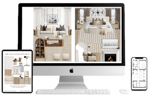
Here is a beautiful modern classic bathroom I designed with Valspar Office Blue!

Shop this bathroom moodboard – design and decor ideas:

Here are some gorgeous coordinating blue decor items that will create a pulled together look in conjunction with any of these blue wall colors:
True Color Expert® Paint Color Tip: Did you know that a paint color will look 2 times as intense on interior walls and 3-4 times brighter on exteriors than the paint chip sample?!
This is due to:
- the scale of the paint color on the walls compared to the small paint chip
- the light reflection on painted walls
- For exteriors- it’s due to natural light that washes out the paint color

Glidden Sterling Silver
This is an uplifting light blue paint color with a gray undertone that makes it classic and timeless.
It has a hint of purple in it giving it a periwinkle look.
I recommend using this color in a bedroom, powder room or ensuite bathroom.
Glidden Sterling Silver is available here.
Designer and True Color Expert® Tip: Always test your paint colors to make sure they work with the fixed elements of the room (flooring, tile, upholstery).

Portola Paints Cyclone
A gorgeous dark blue with a blue gray undertone.
This grayed blue is calming and stylish.
This saturated color would look gorgeous in a bedroom or bathroom.
How to create a cohesive look when using these blue paint colors
To create a cohesive look with these shades of blue paint colors, repeat the blue in the area rug, decor and wall art.
Design Tip: A color should be repeated at least 3 times in order for it to look intentional in the room and to flow in the space.
Coordinating colors
These blue colors will look gorgeous with neutral colors such as white, beige, taupe, brown and black.
These classic colors create a timeless look!
Pair blue saturated colors with lighter colors for beautiful contrast.
Two coordinating white paint colors to pair with these blues are:
- SW Pure White
- BM Chantilly Lace
Coordinating flooring colors with these blue paint colors
Pair these blues with white oak light wood floors which are on trend right now for flooring.
They also look beautiful with dark gray tile, marble tile floors such as marble hexagon tile and walnut flooring.
Coordinating countertop color
The countertop that would look the best with these blues is anything with a marble look – white background and blue gray veining.
Other coordinating finishes for these blue paint colors
Jute, sisal and seagrass all look stunning with these watery blue tones.
Linen is a perfect pairing.
Light wood tables coordinate beautifully as well.
The ‘it’ on trend travertine and alabaster stone looks stunning with these colors too.
Need help selecting the perfect interior or exterior paint colors for your home?
Or need help selecting a whole home color palette?
I’m a Designer and True Color Expert® – I can help!
See my Virtual Interior Design Services, Portfolio and Client Reviews
Contact me for a free quote.
I’d love to work with you!
Which paint sheen should I use?
The paint sheen you select depends on the condition of the wall, the amount of shine you prefer and the amount of traffic the room gets.
Most paint manufactures have a premium, high performance paint line that is washable in any sheen, so you can use the sheen of your choice in any room!
Premium high performance paint also provides the best, uniform paint coverage so you don’t have to do several coats of paint to fully cover a wall!
No matter the application method, wether you are using a brush or roller, it results in an easier, quicker, better looking paint job.
Also if you are hiring a paint contractor for your paint project, they will want to use a more premium paint to guarantee their work.
Washable Flat/Matte Finish
I recommend using a washable matte or flat paint for a luxurious matte finish.
(Avoid using a regular flat paint because it will show fingerprints and scuffs.)
The look of a flat finish creates beautiful depth of color and sophistication.
I personally love the look of a matte finish with no sheen to distract from the actual color.
It’s the ultimate of effortlessly chic!
Matte finish is best for low-traffic areas, that require minimal washing, such as low traffic bedrooms and walls that have less-than-perfect surfaces such as textured walls.
Flat paint also hides common ceiling problems such as uneven ceilings.
Eggshell Finish
The most popular finish is eggshell.
The slight sheen of eggshell creates a softly polished glow.
Because it has a less porous surface, it’s perfect for an easy-to-clean surface.
It allows for gentle scrubbing when cleaning.
For color vitality and color rub-off resistance, use a high-quality, washable eggshell or satin finish paint.
Pearl Finish
This is great for high traffic areas and has an almost iridescent quality creating beautiful results.
It’s in the middle of the sheen spectrum.
Satin
Satin finish is also popular and is the perfect sheen for kitchens, bathrooms and high-traffic areas.
This is a great product for busy spaces—its satin finish offers the perfect balance of subtle sheen and easy cleanability, making it ideal for kitchens, bathrooms, and kids’ rooms. Durable and stylish, it holds up beautifully to everyday life.
It’s also a popular sheen for trim details such as baseboard trim, crown molding, window frames and door trim.
Semi-gloss Finish
This sheen is good for baseboards, door and window trim.
It’s durable, has incredible hide with excellent hiding.
Alkyd and Enamel Paint
For kitchen and bathroom cabinets I recommend a traditional alkyd that’s oil based and eliminates brush strokes or enamel paint that is durable and washable.
When possible use a waterborne formula that has the performance of traditional oil paint but allows for easy soap and water clean up.
It will also provide an extended open-time to achieve high-end finishes.
Other factors to consider:
- If you are new to painting walls: the perfect introduction to paint begins with selecting a high-quality product that not only enhances the beauty of your space but also offers durability, easy application and maintenance, and long-lasting color. Whether you’re refreshing a single room or updating your entire home, the right paint can transform your space while standing up to the demands of everyday life.
- I recommend always using low-voc paint whenever possible!
- For bathrooms, basements and high-humidity environments: select a paint that has mildew resistance.
- For kitchens – experience premium performance with a paint that resists grease, stains, and frequent wipe-downs—ideal for the heart of the home where durability meets style.
- For bedrooms an eggshell or satin finish is the perfect product. Its superior coverage and long-lasting finish provide a soft, elegant sheen while being resistant to scuffs and stains, keeping your walls looking pristine for years.
- Select a paint brand that’s formulated with the latest technology, such as Benjamin Moore Regal Select paint, Benjamin Moore Aura or Sherwin Williams Emerald paint. These interior paint brands offer superior stain resistance, smoother application, and long-lasting color clarity. They are engineered with cutting-edge technology and are designed to perform beautifully in today’s busy, high-traffic homes. The time-honored tradition of Benjamin Moore and Sherwin Williams paints, and their high quality, will never be disappointing!
How To Calculate The Amount of Paint Needed For Your Room
To calculate the amount of wall paint for an interior paint job use the following formula:
- Find the square footage of the room: For each wall in the space multiply the wall height x length of each wall. Add them together for the total square footage of the room. Don’t forget to subtract the square footage for windows and doors to find the actual amount of wall area.
- Divide the total square footage by the coverage per gallon to determine how many gallons you’ll need.
- Most paint cans cover about 350 to 400 square feet per gallon for one coat.
- Multiply by 2 if you’re applying two coats.
- These calculations will give you the number of gallons of paint you need for your paint project.
- Because every wall surface is different this is a rough estimate. You may need more paint for touch ups or if the walls absorb more paint than expected , so I recommend buying 10-15% extra.
More Design & Decor Ideas
- Lake House Bedroom Paint Color Ideas, Furniture & Decor Ideas
- Lake House Cottage Decor
- Small Bedroom Ideas To Maximize Space & Style
- Repose Gray – Undertones & Coordinating Colors
- Behr Blank Canvas Color Of The Year 2023
- Top 50 Bestselling Paint Colors At Sherwin Williams
- 5 Best White Trim Paint Colors
- How to Pick Paint Colors With Confidence!
- How to Make A Mood Board For Interior Design
- Modern Classic Kitchen Design
- How To Arrange Furniture In A Small Living Room
- 15 Minute Bathroom Organization Tips & Declutter Ideas
- 5 Design Tricks To Brighten A Dark Room
- How to Mix Design Styles So They Don’t Clash!
- 8 Tips For Choosing Beautiful Ceiling Colors
Do you help people with new construction paint colors?
Hello Karen – Yes I do! Please email me at [email protected] and we can discuss!