


Sherwin Williams Color of the Year 2027: Celery SW 6421
Sherwin Williams Color of the Year 2027 is Celery SW 6421, a soft, herbal green with subtle yellow undertones. It feels fresh and light, but it has enough warmth to work with the natural materials many of us already have at home.
So, is Celery a color you should actually paint on your walls? As a Designer and certified True Color Expert® at Setting For Four Interiors, here’s my expert design advice on Celery’s undertones, the finishes it works with, where I would use it, and how to test before you buy a gallon.

This post may contain affiliate links. Please read our disclosure policy.

What Is Sherwin Williams Color of the Year 2027?
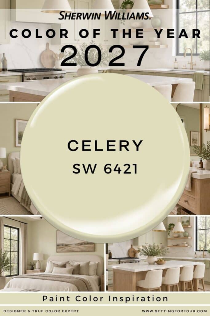
Sherwin-Williams selected Celery SW 6421 as its 2027 Color of the Year. It’s a beautiful airy, herbal green that sits between a soft pastel and a more grounded botanical shade.
Celery signals a move toward color that feels restorative while still bringing personality into a room. Sherwin-Williams Color Marketing Manager Ashley Banbury says it creates a welcoming sense of calm and comfort in everyday spaces. That description fits what I see in the color: it has a gentle presence, but it will still read distinctly green on a large wall.
My designer’s take: Celery is most compelling when you treat it as part of a complete room palette. Pair it with the right white, wood tone, fabric and lighting, and it can look sophisticated. Choose those elements separately, and its yellow undertone may surprise you.
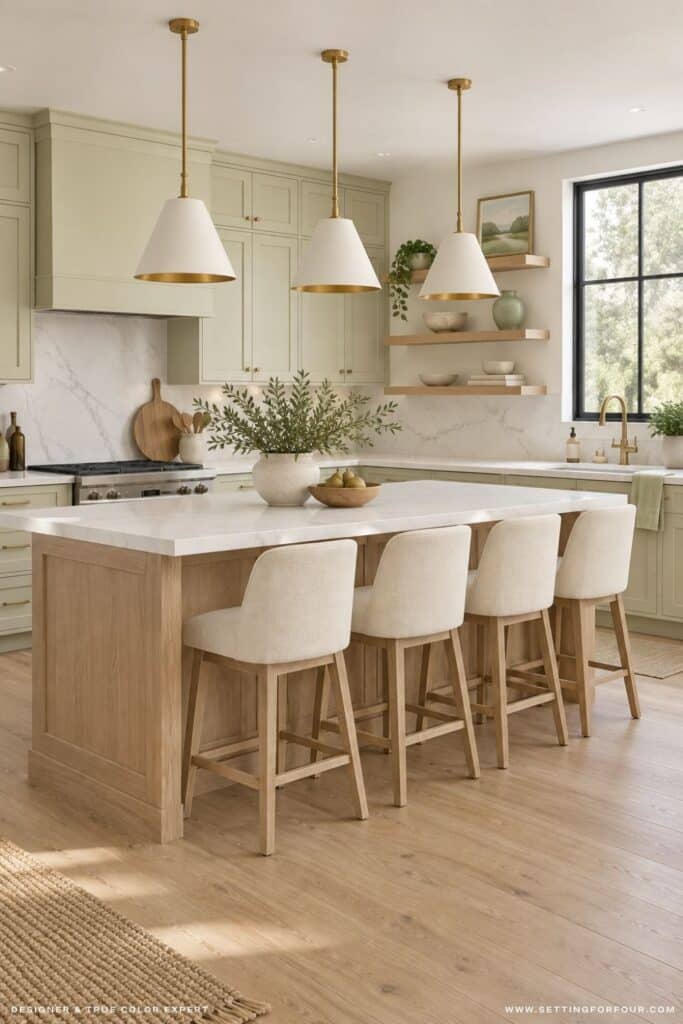
SW celery kitchen cabinet color | kitchen island pendants | kitchen island stools
Need design help with a room update, room renovation or new build home?
Or help selecting furniture, with furniture layout, choosing paint colors or finishes like tile and countertops?
I’m a Designer and True Color Expert® – I can help!
See my Virtual Interior Design Services, client reviews and portfolio.
Contact me or email me at [email protected] for more information!
I’d love to work with you!


My Expert Review of Celery SW 6421
As a Designer and True Color Expert®, I think Celery SW 6421 is a refreshing choice for homeowners who want to bring green into their home without making the room feel dark.
Its subtle yellow undertone gives it a lively, botanical quality that looks especially beautiful with white oak, linen and other natural textures.
I would be careful about pairing it with cool gray flooring or a stark white trim, which could make the yellow more noticeable.
My advice is to sample Celery beside your existing finishes and view it throughout the day. When those undertones work together, Celery can feel both fresh and thoughtfully designed.
What Undertones Does Celery SW 6421 Have?
Celery SW 6421 is a green with a subtle yellow undertone. The yellow gives it a warmer, fresher character than a blue-green or gray-green.
That undertone is the detail to pay attention to. Beside a creamy white and warm wood, Celery may look soft and natural. Beside an icy white, cool gray flooring or a blue-green tile, its yellow side may become more obvious.
True Color Expert® tip: Hold a sample of Celery against your fixed finishes before choosing a trim color. Your flooring, countertops, backsplash and upholstery will influence how you see the paint. A white that looks perfect on its own may look too stark once it is beside Celery and your existing materials.
Where Would I Use Sherwin Williams Celery?
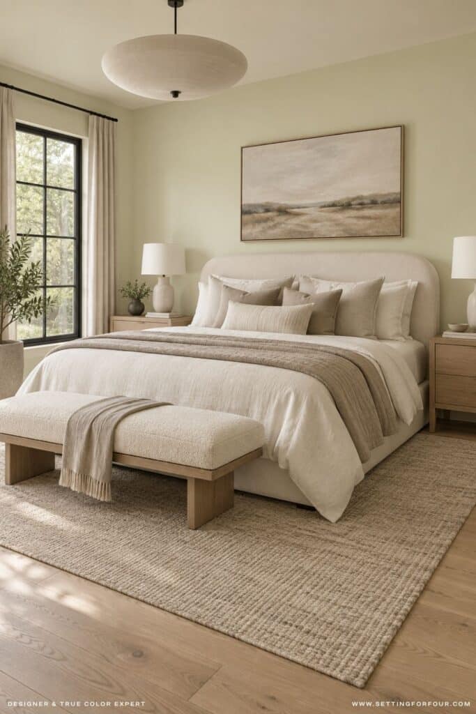
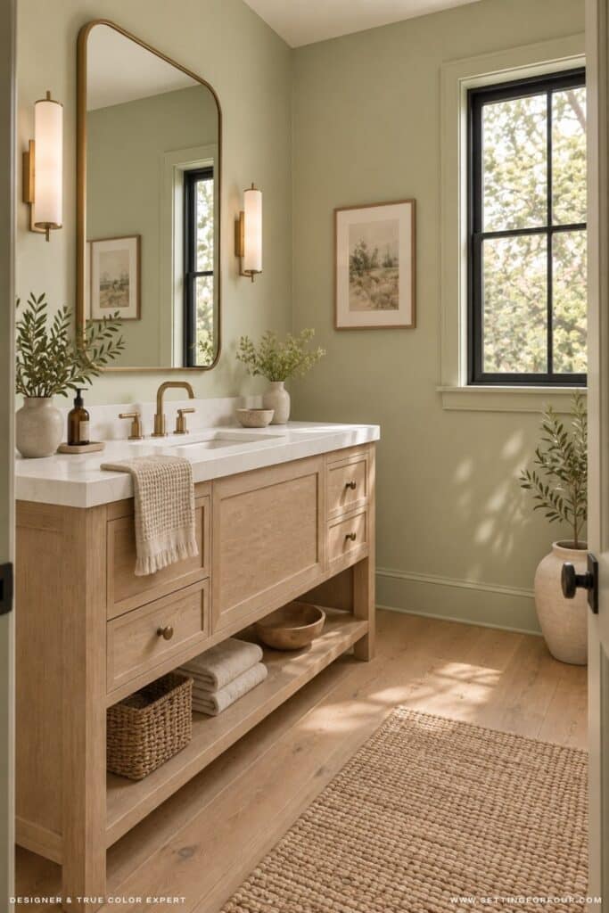
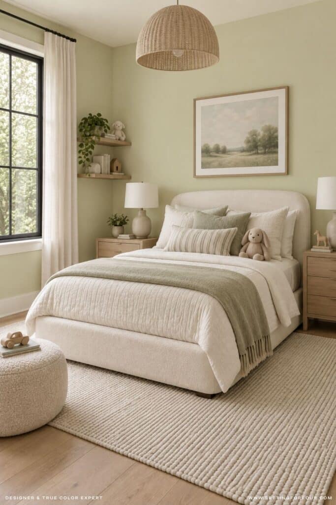
I would consider Celery for a room that needs color without a dark, heavy look. A bedroom, breakfast nook, powder room or home office could be a lovely place to start.
For an Organic Modern look, I would pair Celery walls with white oak, an inviting off-white, linen, stone and a small amount of black or aged brass. In a kitchen, Celery could also be beautiful on a carefully chosen island or run of cabinetry. Sample it beside the countertop and backsplash first, especially if either has a strong undertone.
Celery looks beautiful in a cottage home, lakeside home or home where you want to bring the outdoors in.
You can use Celery on all four walls, but you don’t have to. If you love the color and feel unsure about a full room, try it on built-ins or a piece of furniture. That gives you a chance to enjoy its fresh green character while keeping your main walls neutral!
A Secret Design Tip for Styling Celery
Here’s my secret design tip you won’t find anywhere else: repeat Celery in 3 places in a room to create a cohesive look and give the color impact.
I also recommend combining it with darker greens for a sophisticated stylish look. Dark sage green and dark olive greens look beautiful with SW Celery.
You could repeat SW Celery color and combine it with a dark greens in:
- throw pillows
- throw blanket
- candles
- vases
- faux green stems
- wall art
What Colors Coordinate With Celery SW 6421?
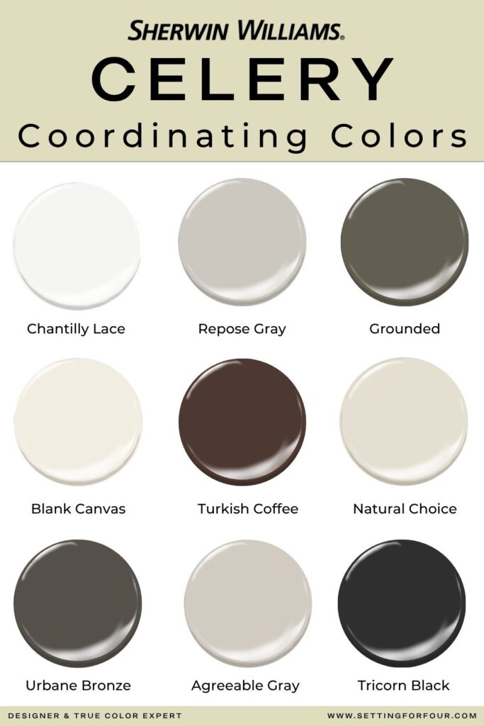
Sherwin-Williams shows Celery with both quiet neutrals and stronger accent colors in its 2027 coordinating palette. My advice is to decide how much contrast you want before choosing a partner.
- For a soft, airy room: Consider a warm white such as Behr Blank Canvas. Compare a physical sample with your existing trim and fabrics.
- For a layered, natural palette: Add woven textures, warm wood and a deeper earthy neutral.
- For more contrast: A deep green or rich brown can give Celery a more tailored look. Behr Grounded and Sherwin Williams Urbane Bronze both are coordinating options.
- For a playful accent: The official palette also includes bolder choices, such as Plum Brown and Woven Wicker. I would use these in small, deliberate doses for most homes. A small Viola marble bowl with a plum brown color or white oak furniture will coordinate with SW Celery.
Color tip: If your trim is already painted, test Celery against that exact white before you plan the room. Repainting every door and baseboard can change the scope and cost of a project.
See 5 Best White Trim Paint Colors for the best trim colors that coordinate with all other colors.
Find the Right White to Pair With Celery
The True Color Expert® White Paint Color Edit can help you choose a white that works with Celery’s yellow undertone and your home’s existing finishes.
It walks you through undertones, lighting and testing so you can make a more confident choice!

How Does Celery Compare With the 2026 Color of the Year?
Universal Khaki SW 6150 was Sherwin-Williams’ 2026 Color of the Year. It is a warm, mid-tone neutral with a slight yellow undertone. Celery is lighter in feeling and makes a clearer green statement.
| Color | Overall effect | My design advice |
|---|---|---|
| Celery SW 6421 — 2027 | Fresh, soft and botanical | Choose it when you want green to be a noticeable part of the room. |
| Universal Khaki SW 6150 — 2026 | Earthy, warm and neutral | Choose it when you want the walls to feel more grounded and understated. |
Both can work with natural materials, but they create different moods. If you loved the warmth of Universal Khaki and want something fresher, Celery is worth sampling. If you want a neutral backdrop for colorful art and furnishings, Universal Khaki may be the easier fit.
Paint Colors Similar to Sherwin Williams Celery
These are colors to sample alongside Celery, they are similar but not exact color matches. I would compare large, physical samples in your own room before substituting one brand or shade for another.
| Brand and color | Why compare it with Celery |
|---|---|
| Benjamin Moore Celery Ice 2030-60 | Another light green to consider if you want a brighter expression of the idea. This is a cool green. |
| Sherwin-Williams Springtime SW 6708 | A yellow-green option to test if you like Celery’s fresh undertone. |
| Behr Celery Sprig 410C-3 | A useful comparison if you are shopping Behr’s range of soft yellow-greens. |
Paint names and online images cannot tell you how close two colors will look on your wall. Different formulas and finishes can change the result, too. Order samples in the paint products you plan to use.
Is Celery a Popular Paint Color?
Celery has just been named Sherwin-Williams’ 2027 Color of the Year, so it is attracting attention.
From a design perspective, I understand the appeal. Celery brings color into the home while still feeling connected to nature. Whether it becomes a lasting favorite will depend on how well people use it with the finishes they already own.
In my opinion it could be a popular color for bedrooms and cabinetry for those that want a change from white walls and white cabinets.

How to Test Celery Before Painting a Room
- Start with a large paint sample.
- Place it on a piece of white poster board so other colors don’t interfere with it.
- Move it to more than one wall and check it in natural light, shade and evening lamplight.
- Look at it beside your trim, flooring and largest furniture pieces. A color can appear quite different across those settings.
Measurement tip: Before buying paint, measure each wall’s width and height. Add the wall areas together, then account for large doors and windows. Give your painter or paint retailer those measurements, along with the number of planned coats and the paint product you’ve chosen, so they can help estimate the right quantity. For cabinetry, measure the surfaces you’ll actually paint rather than using the room’s floor area.
I keep useful preparation and painting products in my Amazon painting supplies shop. A good sample-testing setup, painter’s tape and quality tools are small purchases compared with repainting a room because the color looked different than expected.
My Final Verdict on Sherwin Williams Celery
Celery SW 6421 is an appealing choice if you want a room that feels fresh, gentle and connected to nature. Its yellow undertone gives it personality. That same undertone makes sampling essential, particularly in homes with cool flooring, stark white trim or strongly colored countertops.
My expert advice is to choose the room palette first, then decide whether Celery is the right green within it. That approach helps you create a finished space rather than a lovely paint color that feels disconnected from everything around it.
If you’d like help making those decisions, explore my Virtual Interior Design Services. I can help you select a cohesive color palette and coordinate it with your furnishings and finishes. My virtual services offer an approachable way to get professional design guidance, save time on decisions and avoid costly color or decor mistakes.
Frequently Asked Questions About Celery SW 6421
Is Celery SW 6421 a warm or cool green?
Celery has a subtle yellow undertone, which gives it warmth. However, surrounding finishes and lighting affect how it appears. Test it in your space before deciding whether it feels warm enough for your room.
Does Celery work with white trim?
It can. Compare Celery with your actual trim color rather than assuming any white will work. Pay close attention to whether the white looks too cool or stark beside it.
Can I use Celery on kitchen cabinets?
Yes, if it works with your countertops, backsplash, flooring and adjoining rooms. Test a large sample on a cabinet door or movable board, and check it at different times of day.
Is Celery the same as sage green?
No. Celery has a fresher, more noticeable yellow-green character. Many sage greens appear grayer or more muted. Compare samples if you are deciding between the two looks.
What is the best way to sample Celery?
Use a large peel-and-stick sample made from real paint. Move it around the room, view it against fixed finishes, and check it in both daylight and artificial light.
More Paint Color and Design Advice From Setting For Four Interiors
- Behr Grounded Color of the Year 2027: Expert Review
- Top 50 Bestselling Paint Colors At Sherwin Williams
- How To Arrange Furniture With An Open Concept Floor Plan
- Top 50 Exterior Home Paint Colors From Sherwin Williams
- How to Decorate a Console Table Like a Designer
- Sherwin Williams Evergreen Fog Color Review
- Big Impact Living Room Decorating Ideas
- Why Your Home Feels Off And the Designer Secrets to Fix It
- Sherwin Williams Acacia Haze Paint Color
- 5 Best White Trim Paint Colors
- Sherwin Williams Quietude Paint Color Review
- 10 Designer Tricks to Make a Small Space Feel Bigger
- Benjamin Moore Cinnamon Slate – Color Review
- Small Bedroom Ideas To Maximize Space & Style