


Benjamin Moore Color of the Year 2027: Webster Green
Benjamin Moore Color of the Year 2027 is Webster Green HC-130, and this stunning, sophisticated green might be the most timeless paint color announcement of the year!
If you love classic interiors, organic modern design, natural materials, and beautiful paint colors that make a room feel luxurious, you’ll want to take a closer look at this gorgeous green.
Benjamin Moore has selected Webster Green HC-130 as its 2027 Color of the Year, celebrating the return of rich, confident greens that feel both traditional and fresh.
But is Webster Green the right paint color for your home? What undertones does it have? Which white paint colors coordinate with it? And where should you use it?
As a Designer and Certified True Color Expert®, I’m sharing my expert design advice on Webster Green, including its undertones, coordinating colors, beautiful room applications, and the decorating mistakes I recommend avoiding.
I’ll also share my favorite designer secrets for making this green look expensive, sophisticated, and timeless.

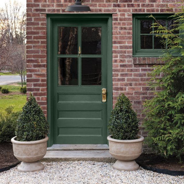
BM Webster Green – a beautiful, warm green that’s classic and timeless!

What Is Benjamin Moore Color of the Year 2027?
Benjamin Moore’s Color of the Year 2027 is Webster Green HC-130, a classic mid-tone green from the brand’s Historical Collection.
This beautiful paint color strikes a balance between blue and yellow influences, creating a green that feels grounded yet full of personality.
Unlike pale sage greens or extremely dark forest greens, Webster Green has enough color presence to make a statement without feeling overly dramatic.
It works especially well with:
- Natural white oak and medium-toned wood furniture
- Soft white and ivory paint colors
- Natural stone and marble
- Linen, wool, and textured upholstery
- Aged brass and matte black finishes
- Classic architectural details
What I love most about Webster Green is its ability to bring a sense of permanence to a space.
My designer opinion: Webster Green is an excellent choice for homeowners who want to incorporate color without sacrificing a classic, timeless aesthetic.
It feels particularly appropriate for organic modern, transitional, modern traditional, and quiet luxury interiors.
Why Benjamin Moore Chose Webster Green for 2027
Benjamin Moore’s 2027 color selection reflects a growing appreciation for timeless design, heritage-inspired colors, and interiors that feel personal and welcoming.
Rather than choosing an overly trendy shade, Benjamin Moore selected a green with historical character and contemporary appeal.
Andrea Magno, Vice President of Brand, Color and Integrated Marketing at Benjamin Moore, explains:
“The green colour family’s ability to adapt and transform makes it incredibly timeless.”
That versatility is exactly what makes Webster Green interesting!
It can feel classic in a traditional home, sophisticated in a modern interior, or relaxed when paired with natural materials.
Green is also a popular decorating color. Benjamin Moore includes several greens, including October Mist, Vintage Vogue, and Essex Green, among its most popular green paint colors.
Need design help with a room update, room renovation or new build home?
Or help selecting furniture, with furniture layout, choosing paint colors or finishes like tile and countertops?
I’m a Designer and True Color Expert® – I can help!
See my Virtual Interior Design Services, client reviews and portfolio.
Contact me or email me at [email protected] for more information!
I’d love to work with you!


In my opinion, its versatility gives it the potential to remain relevant long after 2027.
Benjamin Moore Webster Green HC-130 Undertones
Understanding the undertones of Webster Green is essential before using it in your home.
As a Certified True Color Expert®, one of the first things I evaluate when selecting paint colors is how their undertones interact with the room’s fixed finishes, furnishings, and natural lighting.
Webster Green is a mid-tone green with a balance of blue and yellow influences.
It doesn’t read like a pale, silvery sage or an extremely yellow olive green.
Instead, it has a more classic, balanced green appearance.
However, the color can change depending on the room’s lighting and finishes – it’s a chameleon color.
How Webster Green Looks in Natural Light
In bright natural light, Webster Green may appear fresher and more colorful.
The green becomes more noticeable, particularly when surrounded by white trim and light-colored furnishings.
This makes it a beautiful choice for rooms with generous windows.
How Webster Green Looks in North-Facing Rooms
North-facing rooms often receive cooler, indirect daylight.
This lighting can emphasize the cooler qualities of a green paint color and make it appear more subdued.
My recommendation is to test Webster Green alongside your flooring, trim, and major furniture pieces before committing.
How Webster Green Looks in South-Facing Rooms
South-facing rooms generally receive warmer, stronger natural light.
This can emphasize the warmer qualities of Webster Green, making it appear livelier.
If your room has warm wood floors, beige upholstery, or warm stone finishes, compare them carefully with the paint sample.
Designer Color Tip
Never select a green paint color by looking at the paint chip alone.
Place a large peel and stick paint sample on white poster board against the wall and compare it with a true neutral white, your existing trim, and the room’s fixed finishes.
This makes it much easier to identify how the green is actually behaving in your space.
Benjamin Moore Webster Green LRV: Why It Matters
With an LRV of 20.2, this mid-to-deep green absorbs more light than it reflects, creating a cozy, dramatic feel. It can look especially rich in rooms with limited natural light.
LRV stands for Light Reflectance Value. It measures the percentage of visible light a paint color reflects on a scale from 0 to 100.
A lower LRV means a paint color reflects less light, while a higher LRV indicates greater light reflection.
Best Coordinating Colors for Benjamin Moore Webster Green Color of the Year 2027
Choosing the right coordinating paint colors is one of the most important steps in making Webster Green look sophisticated.
Because Webster Green has a noticeable green presence, I recommend balancing it with carefully selected whites, muted neutrals, and natural materials.
It pairs well with rich dark brown, light beige, black and white as well as dark burgundy, very light green and dark green.
Here are my favorite directions for creating a cohesive color palette.
1. Benjamin Moore White Down OC-131
White Down is part of Benjamin Moore’s official 2027 Color Trends palette.
It’s a beautiful option to explore when you want a softer, warmer contrast with Webster Green.
Consider it for adjoining walls, ceilings, or trim, depending on your room’s existing finishes.
2. Benjamin Moore White Dove OC-17
White Dove is another white I would sample with Webster Green.
Its soft appearance can create an inviting contrast without the starkness of a very crisp white.
I especially like this direction for bedrooms, living rooms, and traditional interiors.
3. Benjamin Moore Chantilly Lace OC-65
For a cleaner, brighter contrast, consider Chantilly Lace.
This white can make the green feel more defined and contemporary.
It’s worth testing in spaces with crisp white finishes and black accents.
4. Benjamin Moore Swiss Coffee OC-45
Swiss Coffee is a softer white that can complement organic modern interiors.
I would consider it alongside Webster Green when the room includes warm wood tones, natural stone, and ivory textiles.
However, always test the combination to make sure the undertones work together.
My Expert White Paint Color Advice
Not all white paint colors work with every green.
A white that looks beautiful on its own can appear too yellow, too gray, or too stark beside Webster Green.
That’s why I created my True Color Expert® White Paint Color Guide.
This guide helps you understand and select beautiful white paint colors with more confidence, so you can avoid costly paint mistakes.
It’s especially useful when choosing coordinating whites for trim, ceilings, cabinets, and adjoining rooms.
Benjamin Moore Color 2027 Trends Palette
Webster Green isn’t the only beautiful paint color in Benjamin Moore’s 2027 collection.
The official Color Trends 2027 palette includes eight colors:
- Webster Green HC-130
- Nelson Blue CW-635
- White Down OC-131
- Wild Aster 1240
- Shakespeare Tan 228
- Antique Copper 1169
- Townsend Harbor Brown HC-64
- Durango 2137-30
This palette combines traditional character with warm, welcoming colors and a modern sensibility.
I especially love the idea of pairing Webster Green with soft whites, muted blues, earthy browns, and warm natural finishes.
My designer recommendation: You don’t need to use every color in a trend palette. Choose one main color, one supporting neutral, and one or two carefully selected accents.
This creates a more cohesive, luxurious look.
Best Rooms to Use Benjamin Moore Webster Green
One of the reasons I like Webster Green is its versatility.
You can use it as a statement color or incorporate it into a more neutral decorating scheme.
Here are the rooms where I would consider using this beautiful green.
1. Webster Green Kitchen Cabinets
Webster Green could be stunning on kitchen cabinets, especially in a kitchen with white oak accents, natural stone, and classic architectural details.
For a timeless kitchen design, I would pair it with:
- Soft white walls
- White or lightly veined stone countertops
- Natural white oak accents
- Aged brass or matte black hardware
- Simple, understated lighting
If you’re hesitant about painting every cabinet green, consider using Webster Green on the kitchen island or a built-in hutch.
Designer tip: Always compare green cabinet paint with your countertop and backsplash samples. A mismatch in undertones can make an otherwise beautiful kitchen feel disconnected.
2. Webster Green Living Room
For an organic modern living room, Webster Green can create a beautiful backdrop for neutral furnishings.
I would pair it with an ivory sofa, white oak furniture, textured pillows, and soft linen drapery.
Add a few dark accents to give the space definition.
A beautiful way to incorporate this color is through painted built-ins or a feature wall with architectural molding.
For additional texture, consider neutral decorative pillow covers that complement the green without competing with it.
3. Webster Green Bedroom
Webster Green can give a bedroom a cozy, enveloping feeling.
I especially like the idea of using it on the wall behind the bed, paired with ivory bedding, natural wood nightstands, and soft lighting.
For a more dramatic bedroom, consider painting all four walls in Webster Green.
Keep the bedding and window treatments light to balance the stronger wall color.
4. Webster Green Bathroom
A bathroom is a wonderful place to experiment with green.
Consider Webster Green on a vanity, paired with marble-look tile, polished nickel or aged brass hardware, and a beautiful white countertop.
For smaller bathrooms, using green on the vanity rather than every wall can add personality while maintaining a bright, open appearance.
5. Webster Green Entryway
An entryway is another excellent location for Webster Green.
Imagine a beautifully painted green front door, natural wood console, neutral artwork, and a sculptural table lamp.
It’s a sophisticated way to introduce color without overwhelming the rest of your home.
For styling, consider a large neutral ceramic vase filled with relaxed greenery.
6. Webster Green Front Door and Exterior
Webster Green can also create a striking exterior accent.
I particularly like it for a front door surrounded by soft white siding, natural stone, or warm wood details.
It can also be considered for shutters, exterior trim, or siding.
Designer tip: Always test exterior paint samples in direct sunlight and shade. Exterior colors can appear noticeably different from the same paint indoors.
My Secret Designer Tip for Webster Green
Here’s a designer technique I recommend that can make Webster Green feel more expensive and intentional.
Instead of matching your green paint to your decor, create a three-level color relationship.
Here’s how I would do it.
Level 1: Your statement green
Use Webster Green on the cabinets, walls, or architectural feature.
This becomes the main color statement.
Level 2: A quieter green connection
Introduce a more muted green through artwork, patterned textiles, or greenery.
Don’t try to match Webster Green exactly.
The slight variation creates depth and prevents the room from looking overly coordinated.
Level 3: A natural neutral bridge
Use white oak, ivory linen, natural stone, or woven materials to connect the different greens.
This is what makes the color palette feel balanced and sophisticated.
The secret is allowing Webster Green to be the strongest green in the room while the other colors support it.
My expert design advice: A beautiful room should feel collected and layered, not as though every accessory was purchased to match one paint swatch.
Design Tip for Benjamin Moore Color of the Year 2027
Before painting an entire room, buy a large peel and stick paint sample and place it on white poster board
to help isolate the color.
Then place it in different areas of the room.
Check it:
- Beside your existing trim
- Near your flooring
- Against your cabinets or countertop
- In direct natural light
- In shaded areas
- Under your evening lighting
This simple step can prevent an expensive repaint.
For the project itself, you’ll find useful supplies in my Amazon Painting Supplies Shop, including tools for preparing and painting your space.
Benjamin Moore Webster Green vs. Similar Paint Colors
If you love Webster Green but want to explore other options, here are four green paint colors I recommend comparing.
These are alternatives to sample, not exact color matches.
Benjamin Moore Cushing Green HC-125
Cushing Green is another heritage-inspired green worth exploring.
It’s a good comparison if you want a traditional green with a somewhat different balance of depth and undertones.
Sherwin-Williams Rookwood Dark Green SW 2816
Rookwood Dark Green is a beautiful historic green that can work in traditional and transitional spaces.
Compare it with Webster Green if you’re considering a rich green for cabinetry, built-ins, or architectural features.
Behr Grounded T27-01
Behr Grounded, the brand’s 2027 Color of the Year, is a deeper, mossy olive green.
It offers a moodier, more earthy alternative to Webster Green.
I particularly like this direction for organic modern interiors with natural stone and wood.
Benjamin Moore Backwoods 469
Backwoods is another green worth sampling.
Its deeper, muted character makes it a useful comparison when you want a more subdued effect.
Important color tip: Paint brands use different formulations and pigments. Even colors that appear similar online can look quite different in person.
For the most accurate comparison, order actual samples from each manufacturer rather than relying on digital color swatches.
Benjamin Moore Color of the Year 2027 vs. 2026
Benjamin Moore’s 2026 Color of the Year was Silhouette AF-655, a rich, sophisticated blend of espresso brown and charcoal influences.
The transition from Silhouette to Webster Green is interesting because both colors emphasize timelessness, depth, and classic design.
However, they create very different moods.
Silhouette AF-655:
- Deep espresso and charcoal character
- Moody and dramatic
- Inspired by classic tailoring
- Beautiful for sophisticated, intimate spaces
Webster Green HC-130:
- Balanced, classic green
- Fresh yet grounded
- Inspired by the timeless versatility of green
- Beautiful for cabinetry, walls, doors, and architectural details
In my opinion, Webster Green offers a more colorful direction while maintaining the sophistication Benjamin Moore emphasized in 2026.
Both colors work beautifully with natural materials and thoughtfully layered neutrals.
However, I would choose Webster Green when I want to introduce a stronger connection to nature and a more noticeable color statement.
Is Benjamin Moore Webster Green a Popular Paint Color?
Green continues to be an important color family in interior design.
Benjamin Moore’s own popular-green collection includes shades such as October Mist, Vintage Vogue, and Essex Green.
For 2027, other paint manufacturers have also embraced green.
Sherwin-Williams selected the light, fresh Celery SW 6421 as its Color of the Year, while Behr selected the darker, earthier Grounded T27-01.
This gives us three distinct interpretations of green for 2027.
From my perspective, this is a meaningful design direction.
However, an annual Color of the Year announcement is a forecast of color direction, not proof of actual consumer purchasing preferences.
There aren’t yet reliable published sales figures demonstrating how popular Webster Green will become.
My prediction as a Designer and True Color Expert®: Classic greens that coordinate with natural materials have strong long-term decorating potential, particularly when they’re used in ways that complement the home’s architecture.
How to Decorate With Webster Green Without Making a Room Feel Dark
One concern homeowners often have about green paint is that it might make a room feel too dark or heavy.
The solution isn’t necessarily to avoid green.
It’s to balance the color properly.
Here are my favorite ways to keep Webster Green looking beautiful.
Add Light-Colored Furnishings
Ivory, soft white, and light neutral upholstery can create contrast against green walls.
This helps the room feel lighter and more layered.
Include Natural Wood
White oak, walnut, and other wood finishes can bring warmth and texture to a green room.
Choose wood tones that complement the paint rather than competing with it.
Use Multiple Sources of Light
Combine overhead lighting with table lamps, floor lamps, and wall sconces.
Layered lighting helps prevent dark corners and creates a more inviting atmosphere.
Add Soft Window Treatments
Floor-length drapes can make a room feel more finished and sophisticated.
For an organic modern look, I love soft ivory linen-look curtains with simple hardware.
Explore ivory linen-look curtain panels for a timeless finishing touch.
Repeat the Green Carefully
You don’t need to repeat Webster Green everywhere.
Instead, incorporate small touches of complementary green in artwork, pillows, or greenery.
This creates continuity without making the room feel overly themed.
Common Mistakes to Avoid With Webster Green
Even a beautiful paint color can look wrong when it’s paired with incompatible finishes.
Here are the mistakes I recommend avoiding.
Mistake 1: Choosing a white paint color without testing it.
White paint colors have undertones too. Some whites may appear too yellow or too cool beside Webster Green.
Mistake 2: Ignoring the flooring.
Your wood flooring, tile, and stone finishes influence how green paint appears.
Mistake 3: Selecting paint based on online images.
Screens can distort paint colors. Always evaluate a physical sample.
Mistake 4: Using too many competing accent colors.
A strong green looks more sophisticated when the surrounding palette is carefully edited.
Mistake 5: Forgetting about lighting.
Test Webster Green during the day and at night, using the actual bulbs you plan to keep.
Need Help Choosing the Perfect Paint Colors for Your Home?
Choosing a beautiful paint color is only one part of creating a cohesive, professionally designed room.
The right paint color also needs to work with your flooring, furniture, lighting, cabinetry, countertops, and overall decorating style.
That’s where I can help!
Through my Virtual Interior Design Services at Setting For Four Interiors, I help homeowners create beautiful, functional spaces with expert design guidance tailored to their homes.
My affordable virtual design services can help you:
- Save money by avoiding expensive decorating and paint color mistakes.
- Save time researching furniture, finishes, and coordinating colors.
- Create a cohesive color palette that works with your existing finishes.
- Select beautiful furniture, lighting, and decor with confidence.
- Bring your design vision together with a professional plan.
Whether you’re refreshing one room or planning a larger renovation, I’d love to help you create a home you love.
Benjamin Moore Color of the Year 2027 FAQs
What is Benjamin Moore Color of the Year 2027?
Benjamin Moore’s Color of the Year 2027 is Webster Green HC-130, a sophisticated mid-tone green from the Historical Collection.
What undertones does Benjamin Moore Webster Green have?
Webster Green balances blue and yellow influences, creating a classic green appearance. Its perceived undertones can shift with natural and artificial lighting.
Is Webster Green a warm or cool green?
Webster Green is a relatively balanced green. It has both warm and cool influences, so it should be tested alongside your home’s existing finishes.
What white paint goes with Webster Green?
Benjamin Moore White Down OC-131 is included in the official 2027 palette. Other whites worth sampling include White Dove OC-17, Chantilly Lace OC-65, and Swiss Coffee OC-45.
Is Webster Green good for kitchen cabinets?
Yes. Webster Green can be a beautiful choice for kitchen cabinets, islands, and built-ins. Pair it with carefully selected countertops, hardware, and coordinating whites.
Can Webster Green be used in a small room?
Yes. Webster Green can add personality to a small room, particularly when paired with good lighting and balanced finishes. It can also create a cozy, color-drenched effect.
What colors are similar to Webster Green?
Consider comparing Benjamin Moore Cushing Green HC-125, Benjamin Moore Backwoods 469, Sherwin-Williams Rookwood Dark Green SW 2816, and Behr Grounded T27-01.
Is Webster Green a timeless paint color?
In my professional opinion, Webster Green has strong timeless potential because of its classic green character and compatibility with natural materials. However, whether it remains timeless in a particular home depends on the architecture and surrounding finishes.
What was Benjamin Moore’s Color of the Year 2026?
Benjamin Moore’s Color of the Year 2026 was Silhouette AF-655, a sophisticated espresso and charcoal-inspired color.
What is the Benjamin Moore Color Trends 2027 palette?
The 2027 palette features Webster Green, Nelson Blue, White Down, Wild Aster, Shakespeare Tan, Antique Copper, Townsend Harbor Brown, and Durango.
My Final Thoughts on Benjamin Moore Color of the Year 2027
Benjamin Moore Webster Green HC-130 is a beautiful reminder that timeless design doesn’t have to be colorless.
This classic mid-tone green offers personality, depth, and sophistication while working beautifully with natural materials and thoughtfully chosen neutrals.
As a Designer and Certified True Color Expert®, I especially love its potential for kitchen cabinetry, built-ins, entryways, bedrooms, and elegant living spaces.
My final designer advice: Don’t choose Webster Green simply because it’s the 2027 Color of the Year. Choose it because its undertones, depth, and overall character complement your home.
When the color works with your existing finishes and decorating style, it can create a beautiful space you’ll enjoy for years.
Would you use Webster Green in your home? I’d love to know if you would choose it for kitchen cabinets, a bedroom, a front door, or an entire room!
More Paint Color and Decorating Inspiration
If you love exploring beautiful paint colors and expert decorating advice, you’ll also enjoy these articles on Setting For Four Interiors:
- Behr Grounded Color of the Year 2027
- Sherwin-Williams Celery Color of the Year 2027
- Valspar Cottage Door Color of the Year 2027
- Benjamin Moore Swiss Coffee OC-45 Paint Color Review
- Behr Blank Canvas Paint Color Review
- How To Arrange Furniture With An Open Concept Floor Plan
- Top 50 Bestselling Paint Colors At Sherwin Williams
- How to Decorate a Console Table Like a Designer
- How to Add Texture to a Room: Designer Tips
- How To Create A Cozy Living Room
For more expert color guidance, explore my True Color Expert® White Paint Color Guide.
This post may contain affiliate links. Please read our disclosure policy.